As the idea of the traditional office day and space evolves with the addition of flexible schedules and more people working from home than ever before, so does the concept of a home office. Over the years my “office” has been the coffee table, playroom, husband’s home office and everything in between — basically any place in our home except a space that was my “own”. I wanted to design a home office that would be solely dedicated to MY workspace, ok and maybe Maddox and the cat! In today’s blog, I am excited to share my contemporary chic home office and the essential design factors to incorporate when curating a chic home office.
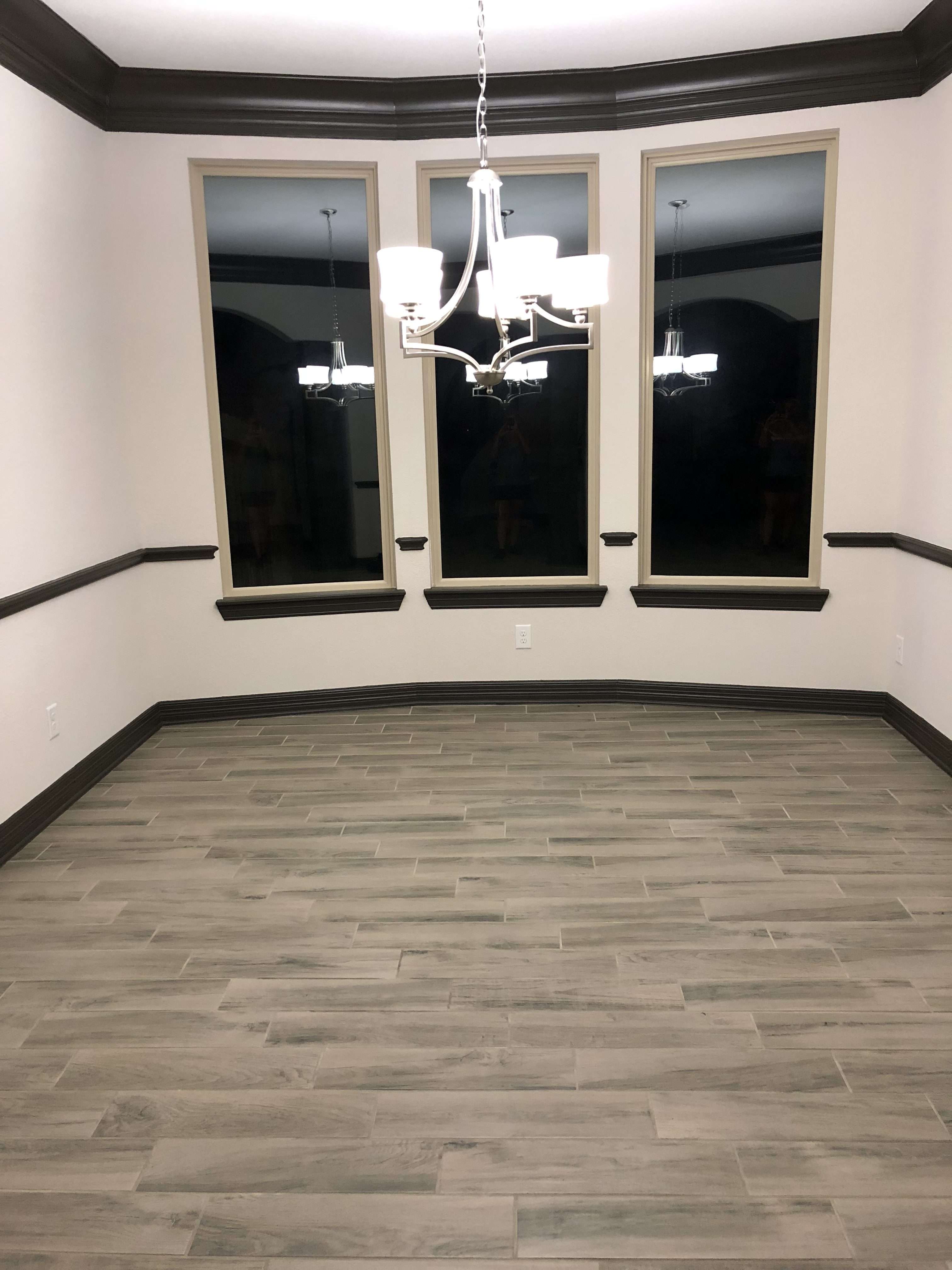
Finding the right space for your home office can be challenging. Our home was built with only one designated office space, which Nick utilizes for his home office. When selecting an area for your home office, be sure to consider accessibility and functionality. Having my office located on our main level was a priority. I wanted it to be easily accessible when hosting meetings with clients. Our formal dining room was the perfect location and wasn’t a room we used since we choose to dine in the kitchen and breakfast area.
Before

Design Factor #1: Branding
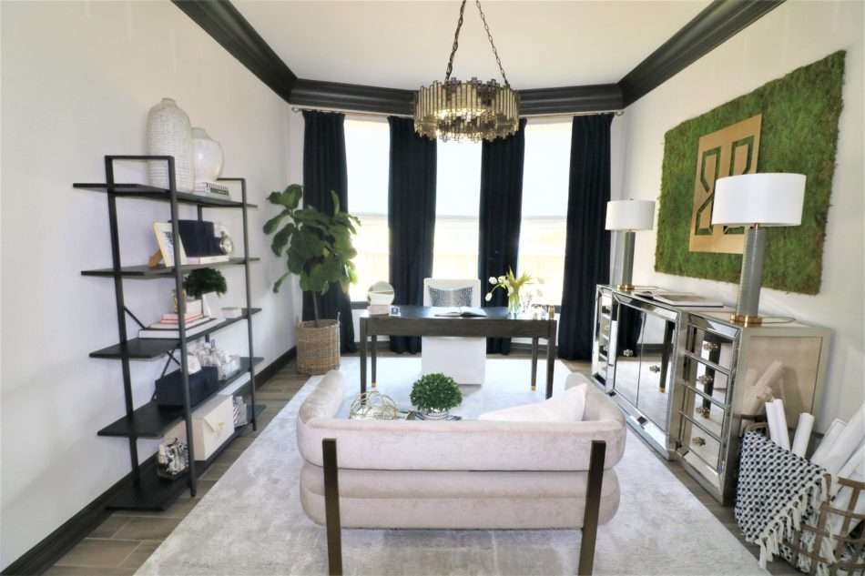
The biggest challenge in transforming this space was to ensure it no longer felt like a dining room but would easily convert to a dining room if should we list our home for sale. I wanted this room to be an extension of the rest of our home and fit that same design aesthetic. Over the past few months, our living room design has shifted with the addition of a new white sofa and chaise lounges. Anytime I am designing a room either for myself or clients, I make sure all rooms flow from one to the next. The goal? Design a home office that is branded to MRI but also was cohesive with the rest of the design elements in the home.
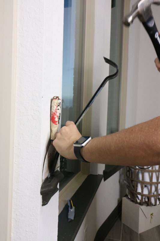
To transform this room, I started with a little elbow grease and demolition by removing the chair rail and replacing the existing light fixture, YES I did that and it was super easy.
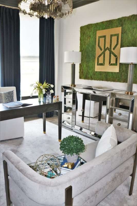
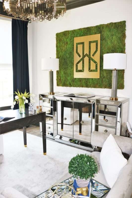
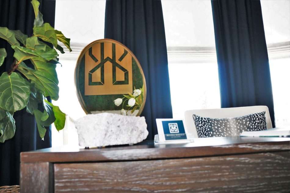
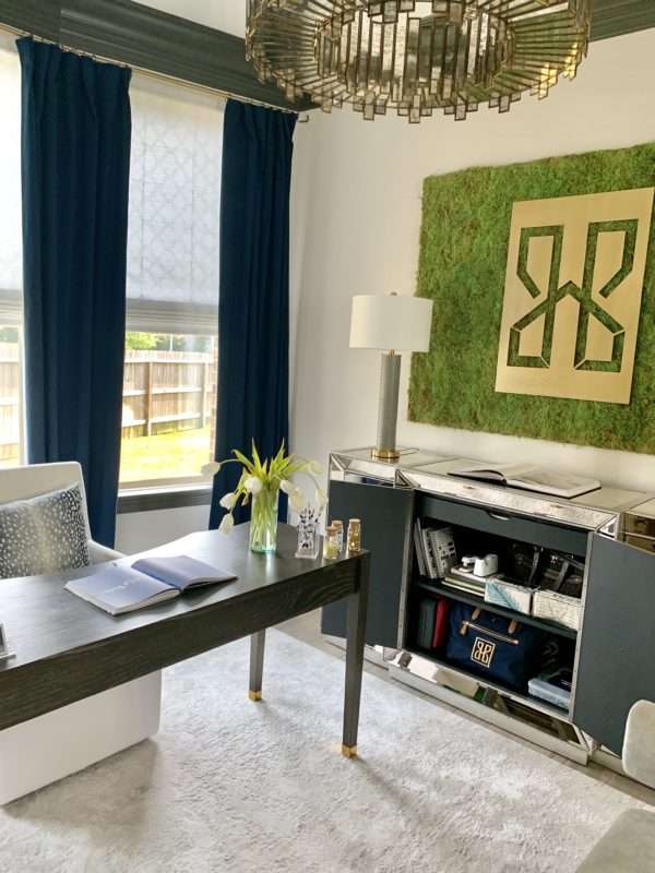
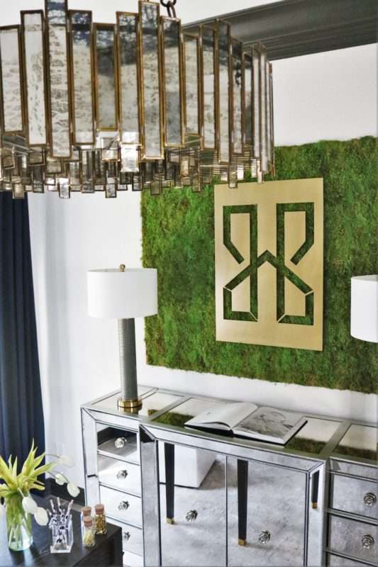
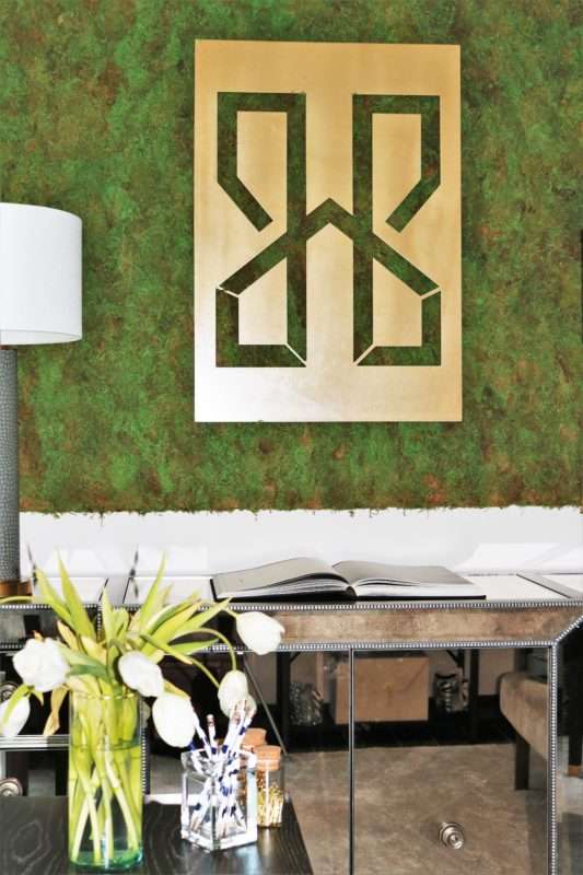
While I was in the early design phase of this room I was simultaneously creating the logo and branding MRI. As soon as my logo was finalized I knew that I wanted it to be on display. What I didn’t know was how. After brainstorming and playing with different ideas I came up with this moss wall idea. I love mixing different textures and materials to create a multi-dimensional space. Incorporating the custom moss wall and the metal MRI logo did just that, instantaneously adding depths of interest and layers. I have a friend who owns a fabrication shop who made this for me, thanks, Ryan! Making your own moss wall can be a super easy DIY project too.
Let The Natural Light Shine
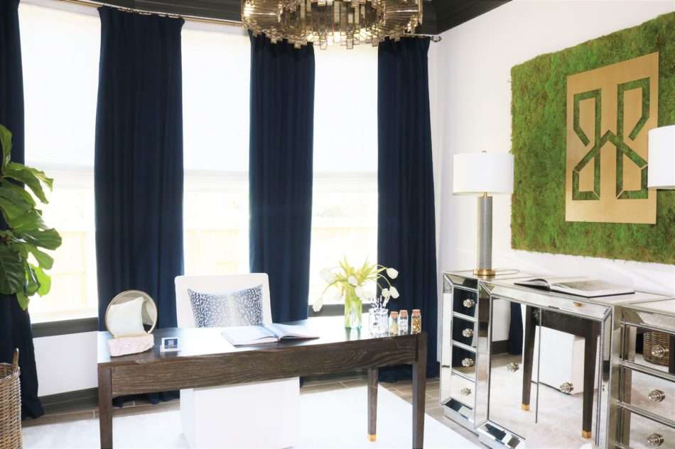
Another reason this space was perfect for my home office is the abundance of natural light. It is proven natural light increases production! Having a wall of windows in this room allowed me to add in more details to add warmth to this space. This room gets a ton of natural light, which I love, but one can only take so much glare on the computer screen. I knew right away I wanted roman shades in place of shutters or blinds. I found the perfect roman shade from 3 Day Blinds.
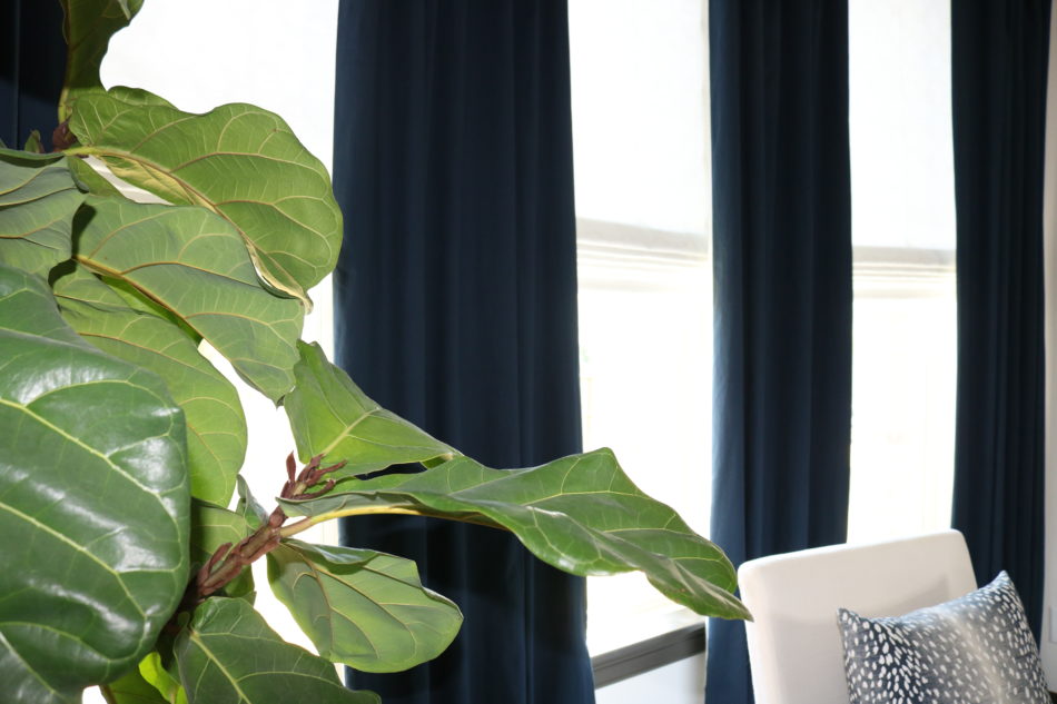
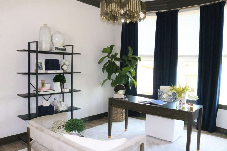
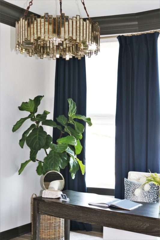
And what MRI office would be complete without NAVY? I was able to integrate MRI signature color, navy, in both bold and intricate details throughout the room. I am quite picky about the navy tone in the MRI brand, leaning more to a black navy (think midnight blue) vs. the more traditional bluer (is that a word? It is now!) navy. I could not believe how easily I found the perfect shade of navy when searching for drapery panels. The overall window treatment design adds such a luxurious feel, truly swoon-worthy!
Pro Tip:
When hanging your drapes, you want to hang the rod as high as possible giving the illusion of taller ceilings. I prefer to install the finials approximately 12″ outside of the windows. This tricks the eye and makes the windows appear larger. In my case, I was limited on both height and width so I maximized using the space I had to work with.
Design Factor #2: Functionality
Shop Window Treatments
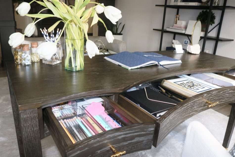
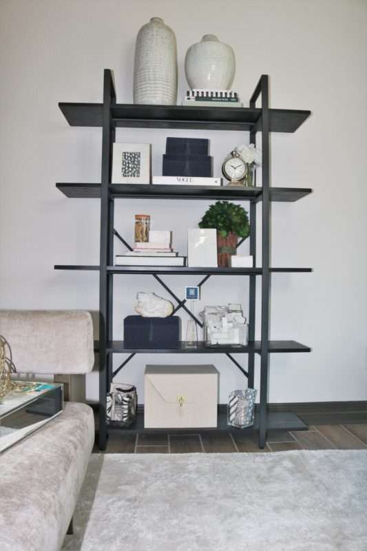
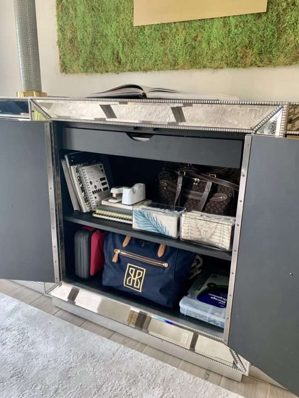
When designing your home office, it is easy to get caught up in the “feel” you want to create. After all, if you look good, you feel good, right?? BUT you have to have a space that WORKS for you! Start by jotting down the requirements for your office. How does your office need to work for you? In my case, I require a lot of space: space for drawing, computer work, storage, samples, and client meetings. In every inch of the desk, bookshelf, and credenza I have utilized the space to maximize storage.
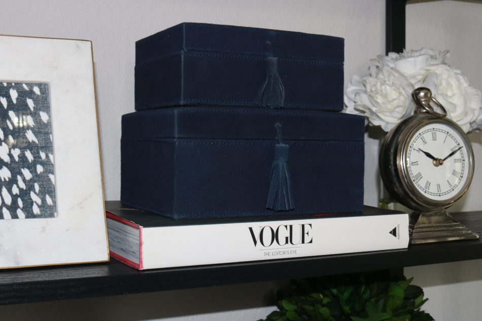
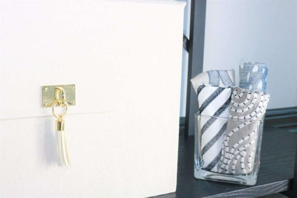
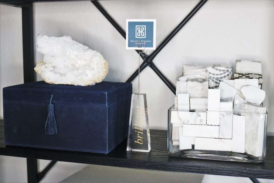
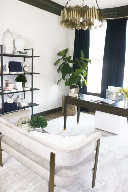
I love the modern, clean lines of this 5-tier storage bookcase. Most of the décor in this space is the work tools/material that I use on a daily, instead of storing it away I chose to showcase them in creative ways. Glass vases filled with tile and textile samples are a great display and accessible. I also keep the blue decorative boxes filled with essentials as well. And those adorable marble boxes, they hold more paperclips and office supplies. Get creative and see what kind of fun ways you can store your not so pretty must-haves.
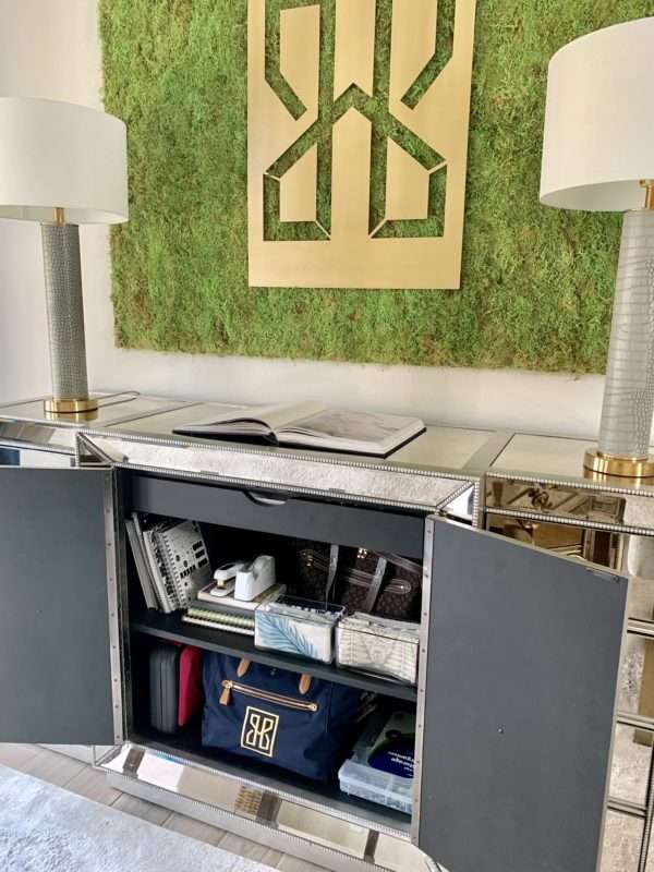
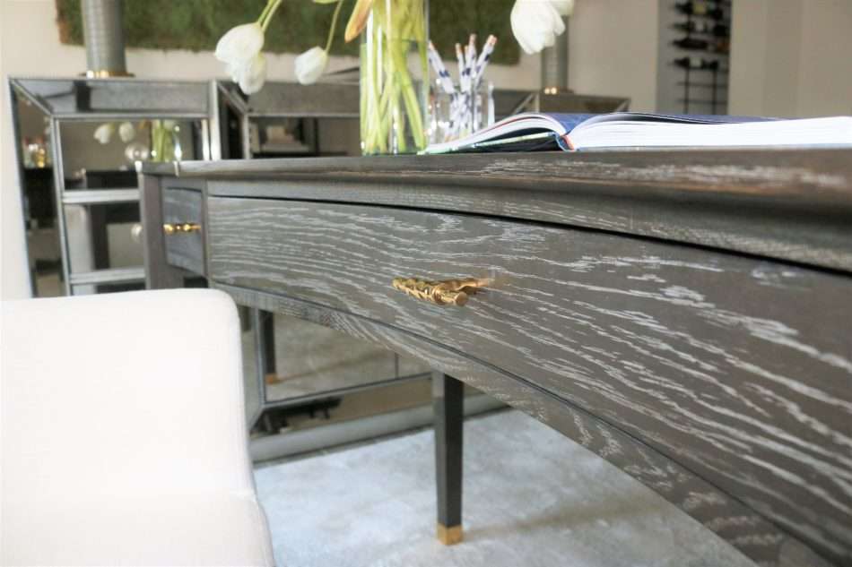
The mirror buffet brings in a level of glamour that this room required. It is also home for all those not so sightly office must-haves.
Shop Home Office Furniture
Design Factor #3: Comfort
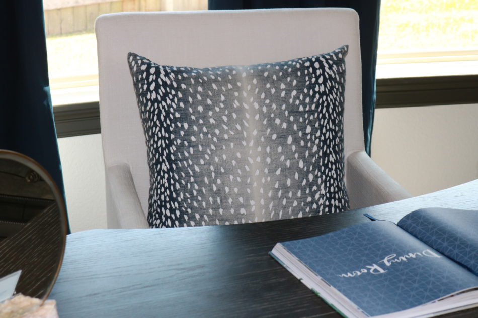
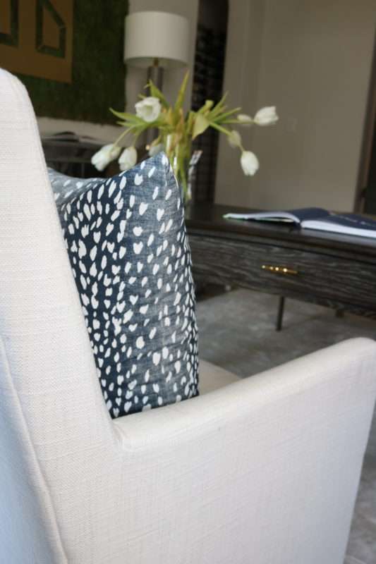
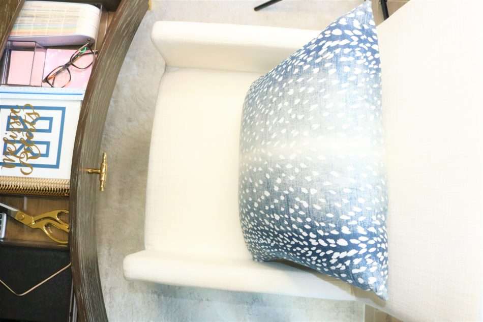
When choosing the furniture for your home office revisit the requirements you listed earlier. If you spend as much time as I do in your office comfort is of most importance. Sitting in an uncomfortable chair while trying to be creative just won’t cut it. I needed a sleek office chair with the perfect non-angled back on casters; this was non-negotiable. Did it take a bit of time to find the ideal chair? Yes! Was it worth the search? ABSOLUTELY! When working in this room before it was styled my feet were so cold and the room just felt empty. That immediately changed when I added a rug. Rugs “ground” the furniture and add another layer of comfort and texture.
Pro Tip:
Dining chairs are an excellent option for desk chairs. The seat height will work perfectly with the standard desk height versus choosing an accent chair that has more of a “slouch” design.
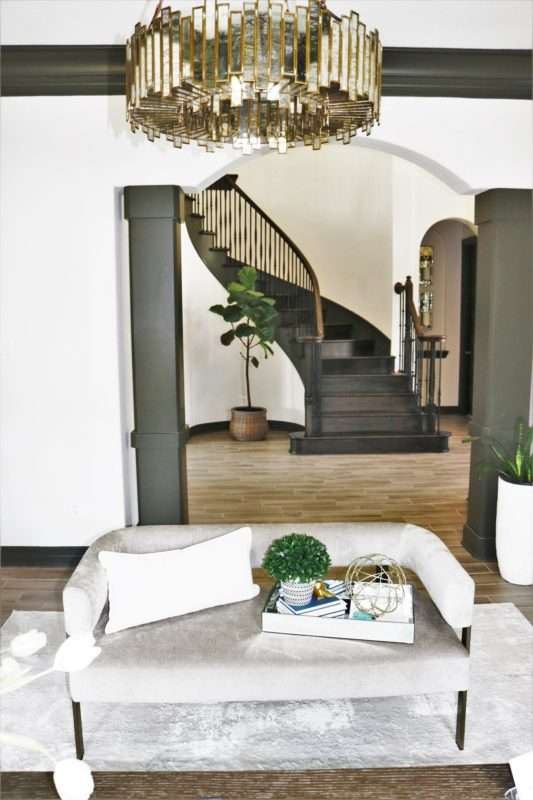
The moment I locked eyes on this taupe settee I knew it was meant for my home office. I love the lush fabric and the curved wraparound back that envelopes you as you sit. Not to mention the hardware finished in blackened brass. Mix those metals!
Work hours don’t always happen while there’s daylight. Spend time choosing the right light bulb being sure to select a color tone for your light fixtures that you find soothing and easy on the eyes. I decided an antiqued mirrored chandelier for this space — the perfect amount of industrial and glam for my chic home office.
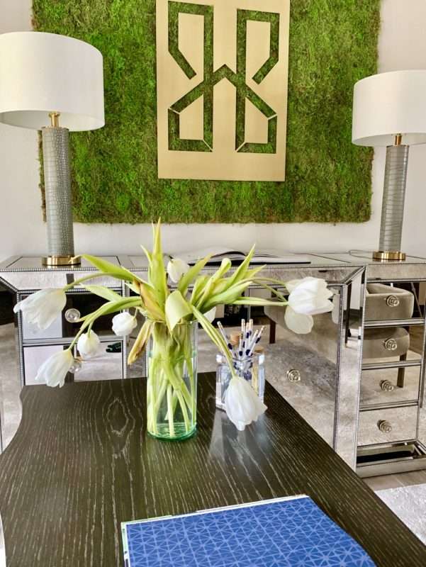
Finding the right desk position was one filled with trials. Ultimately, landing on the commanding spot as known in the land of feng shui. Now I don’t know anything about feng shui, but a girlfriend was over recently and told me all about it. So naturally, I am a feng shui master having selected a curved wood desk which promotes creativity and an increase in natural energy. When designing in a small space look for furniture pieces that double up on form and function. Every item in this space serves a dual purpose making this space high fashion yet practical.
Shop Home Office Decor and Organization
Let Your Brand Represent You
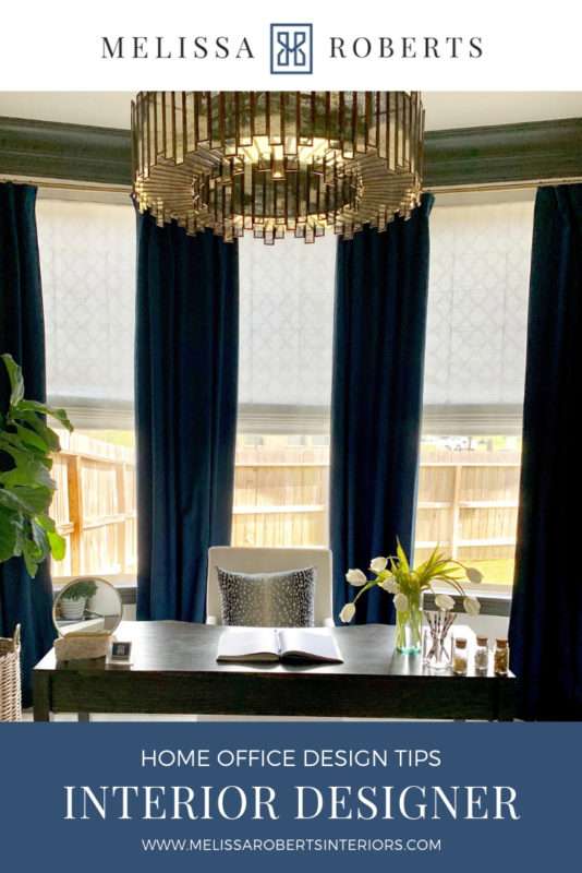
This office is everything I imagined it could be! The design is relaxing, yet chic, with function and comfort both in focus. The room captures the spirit of the MRI brand and is a place I get excited to be in this room designing something beautiful. Maybe this isn’t surprising but this room has also become the place my girlfriends and I find ourselves chatting over a glass of wine. Whether you are creating a home office fit for closing major deals or just looking to make a special space for yourself, don’t forget the essential factors when designing, Focus on branding, functionality, and comfort.







Thoughts?
YOUR COMMENT