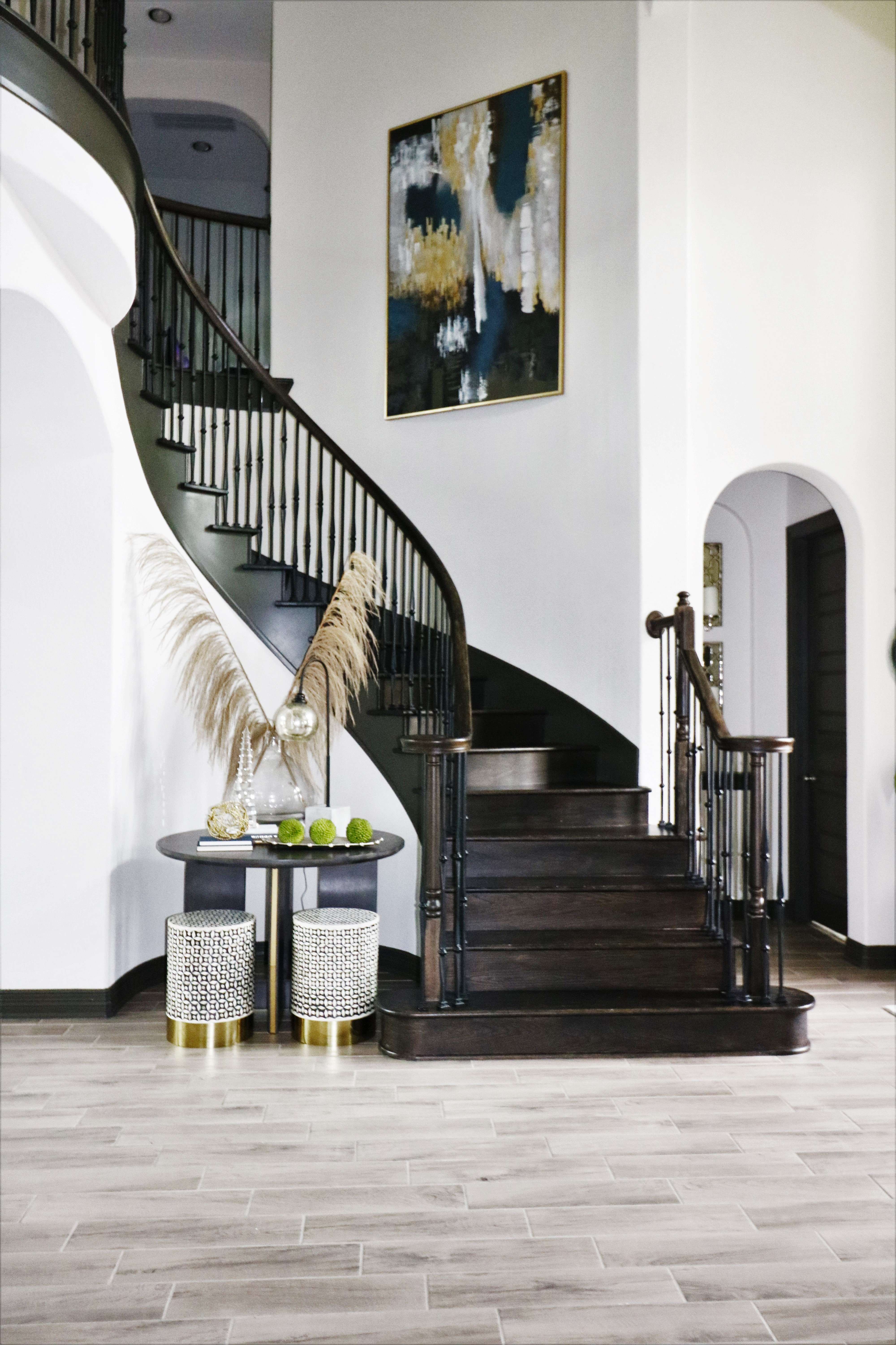
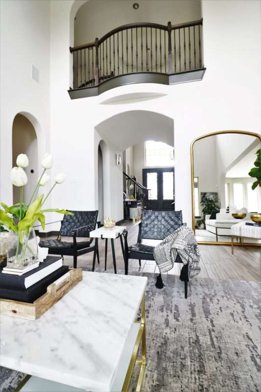
If you follow the blog, Instagram, Pinterest, Facebook it comes as no surprise I have been redesigning many areas of our home. It started with smaller projects, and when we made the decision to stay in our house for a few more years, I cranked up the volume. I wanted to do for myself what I do for others. Make our home more of my ultimate dream home. Can I do everything I want (not at one time – see Nick, showing restraint), but by doing it piece by piece I am creating a new vibe in the house and I LOVE IT!!! Fear, not I promise a full home tour will be coming soon, but in the meantime, I just finished up our entrance/foyer space and today is REVEAL day. I am sharing all the details of our revamped entry foyer with a simple, cohesive design.

THE DESIGN
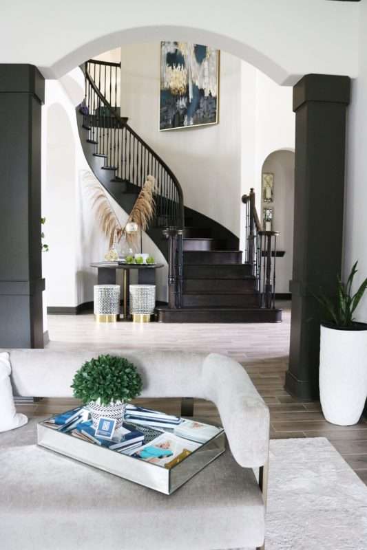
I thought about the design of this space for a LONG time, mainly because my office (particularly my desk) faces the foyer. Naturally, I spend hours a day looking at the area and want it to make a good first impression on our guests. I find myself designing and daydreaming about this space when I need a break from designing for others. This area was designed to connect and unify the main living spaces in the house, bringing them all together with a cohesive feel.

THE TABLE
I get asked by clients and friends all the time for advice on simple projects they want to do. Often my response is one they didn’t think of. Take, for instance, search tabs. Search engines are fantastic, but we forget how one word can complexly change the results. When looking for an entry table instead of just searching that one type, extend to include bistro, dining, and outdoor tables — next, filter by the dimensions that fit your space. Instead of endless searching, this narrows it down to precisely what will work in your room.

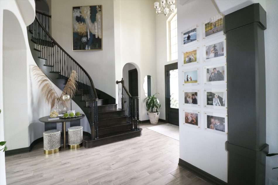
Opting for a modern table with all the right style notes, clean lines, and perfect portions for our entry. Having a rotunda, I needed something more substantial to fill the space, utilizing a dining table instead of a “foyer” table.
THE DÉCOR ACCENTS
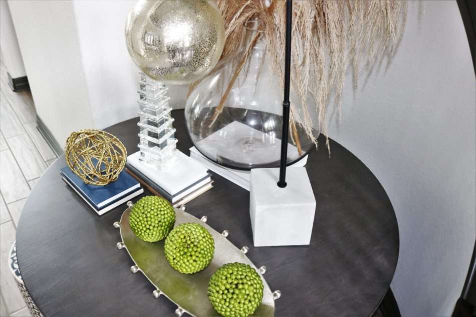
Needing to add height to this space and knowing I wanted to do so with a natural element these Uva stalks were a no brainer. Glass vases are so dynamic and stunning, but can be tricky to style, to see a more simplified look check out the Easter blog. Another option for styling is displaying it on its own, making it a statement piece.
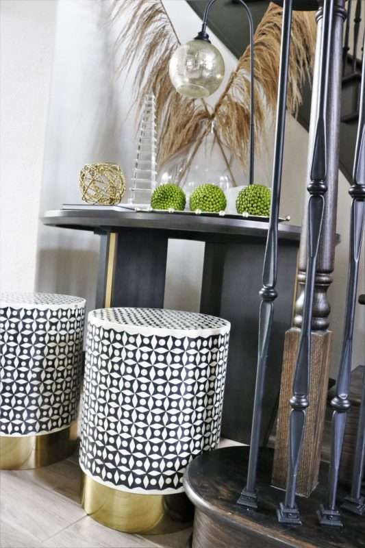

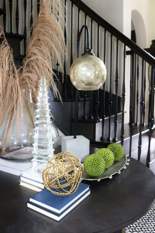
The overall result brings a welcome dose of warmth to this sleek modern table.
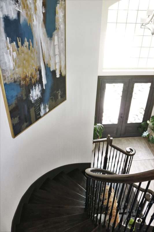
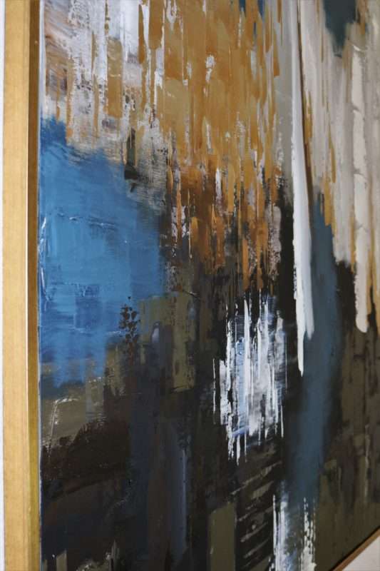
This art may look a little familiar, see it in our living room over the fireplace and the buffet. The staircase is the perfect new home for my beloved Harp & Finial pieces. I am using the art as a statement piece preparing you for the colorful and bright room that welcomes you at the top, which features my favorite navy sofa.
THE GALLERY WALL
I wanted a simple gallery wall featuring our favorite family photos while elevating the standard wall gallery. Enter these contemporary acrylic photo frames. They are sleek, clean and create modern lines allowing the pictures to POP all the while keeping with an overall minimalist feel.
SHOP ENTRY FOYER DÉCOR
Step by step, I am creating my dream home, and I want you to know you can do it too! Yes, it takes time, and the process can be painfully slow, but don’t rush it. Save for the splurge items that have longevity like artwork or a rug. They can be given a second life once you move it to a new space. I can’t wait to keep showing you the progress I am making around the house. The next phase is all about our outdoor space! Y’all know I love seeing what you are doing in your home!! I can’t wait to see how you are revamping your entry foyer spaces; please share it with me by #MRI on your IG post!

