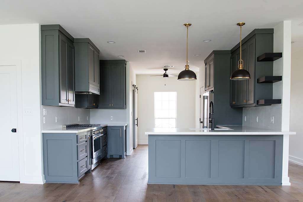
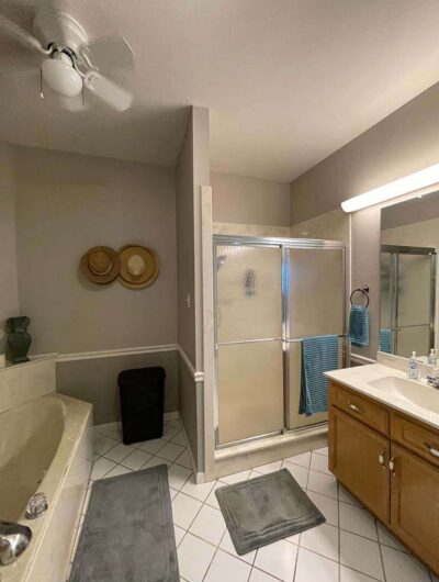
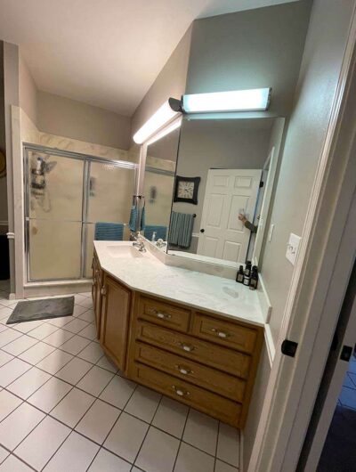
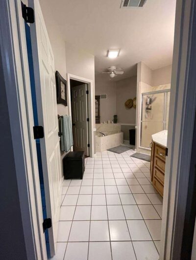
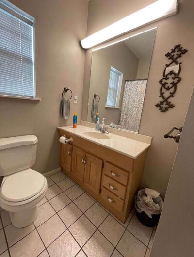
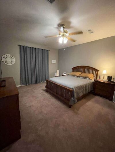
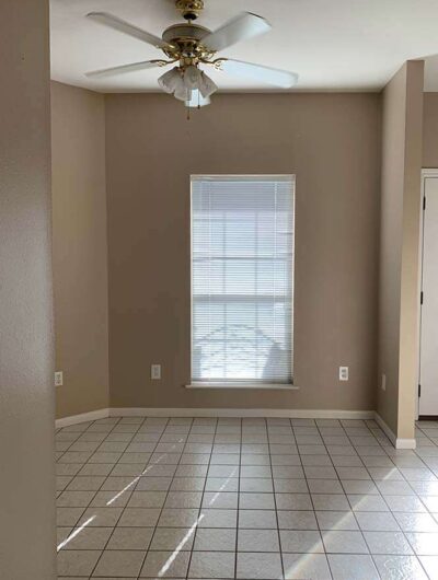
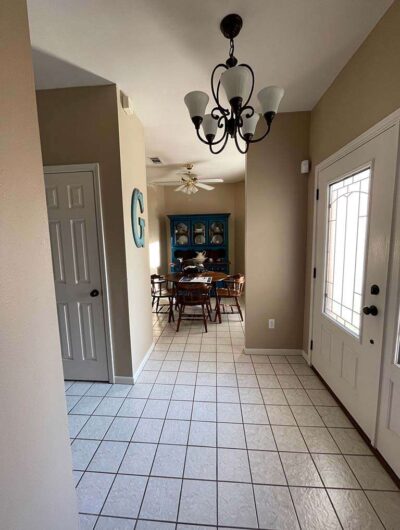
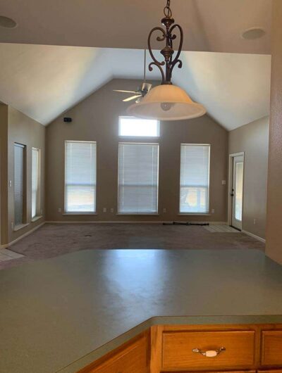
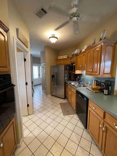
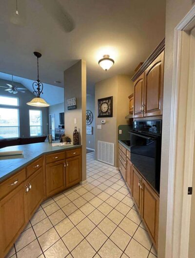
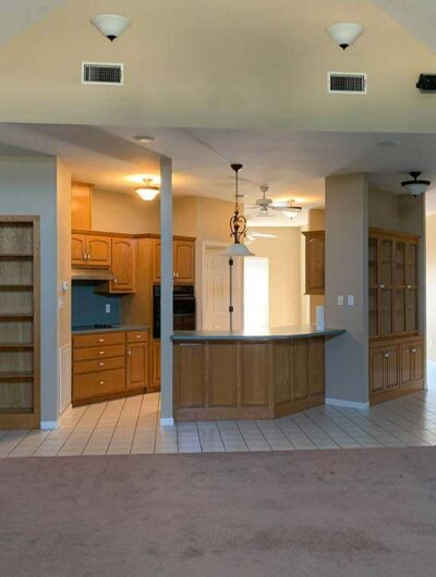
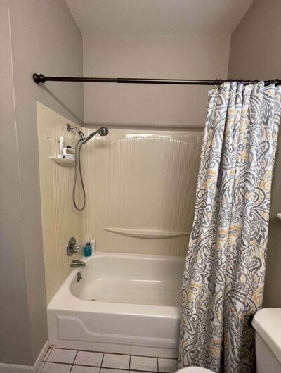
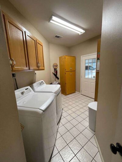
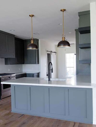
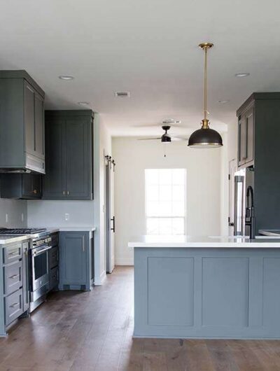
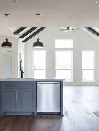
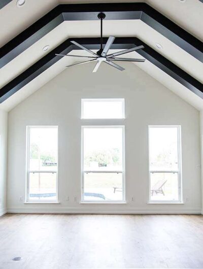
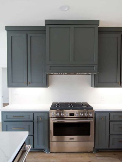
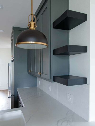
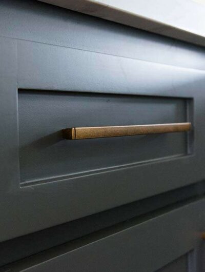
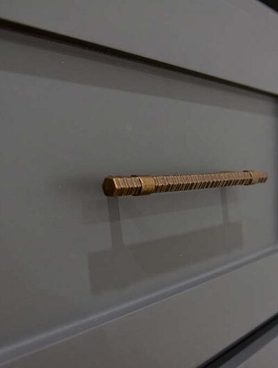
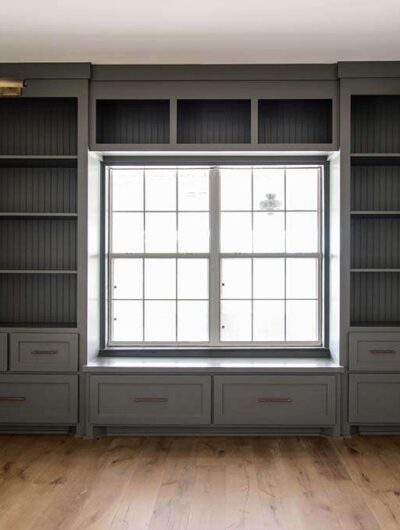
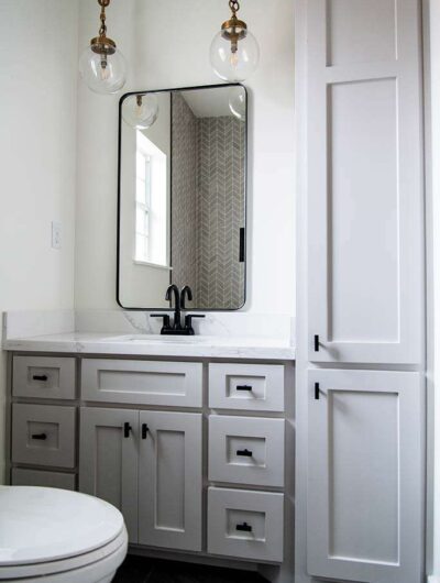
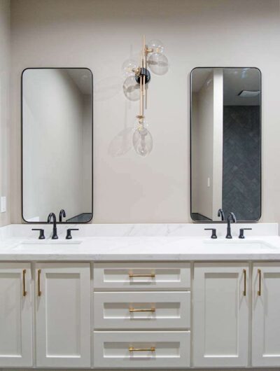
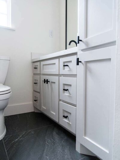
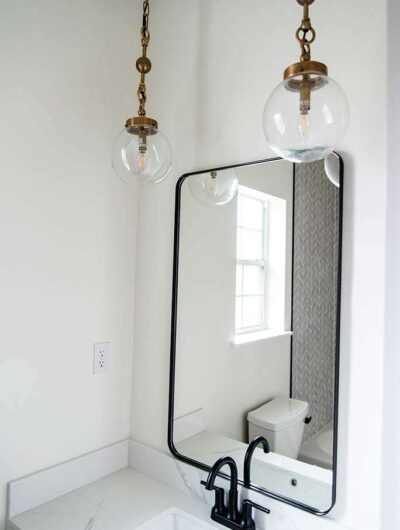
Can you believe this is the same home? We transformed this entire 90’s home that had terrible angles, little functionality, and lacked character. There were three rooms that really didn’t make much sense at all—the laundry room, the kitchen, and the master bathroom. Can you imagine those three rooms not functioning well? We went to the drawing board, knocking down walls, reconfiguring spaces, and curating a simple design. All of this was done on a realistic budget considering resale in the future.
The owners can now open their microwave without hitting a cabinet, the chef (husband in this case) can fire up the stove without feeling claustrophobic, and there’s no custom spice rack the full length of the fridge. Some serious cooing goes down in this kitchen.
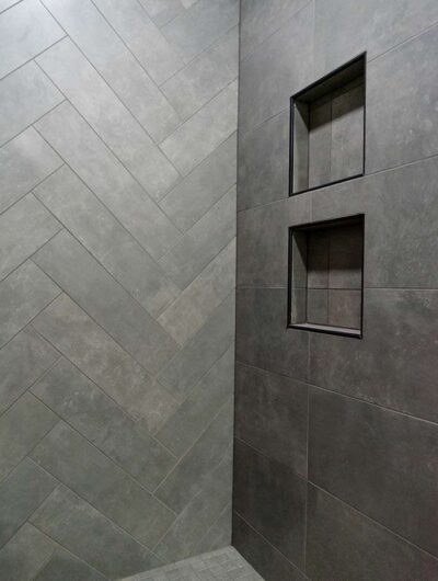
In the master bath, we revamped the space along the laundry room side of the room. We moved the shower, created a new vanity, added a built-in linen closet, and gave this client a soaker tub in a new location.
The laundry room had such a difficult layout to begin with. The walls were all angled, the floor was irregular, and it was difficult to do any laundry there. Now she has a square room to work with, a countertop for folding laundry, and a place to hang-dry clothes.
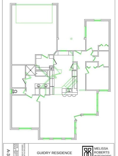
Check out the floor plan we created. An overlay was created to show the client the old walls alongside the proposed new layout. Impressive!
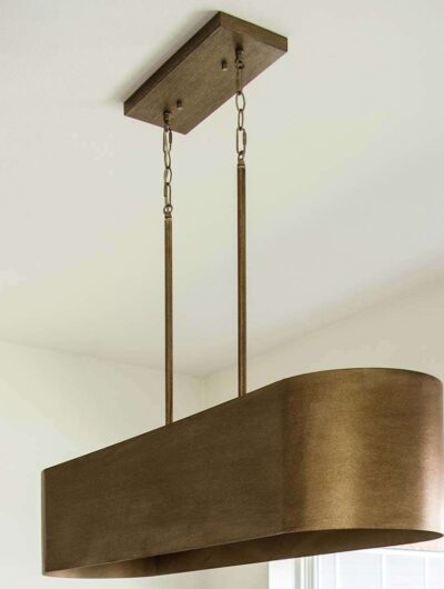
We also revamped all flooring, the guest bath, all lighting, added living room beams, added custom shutters (pics to come on that), and more.
The interior of this home is nothing like it was before. Now it’s time to furnish this beauty!

