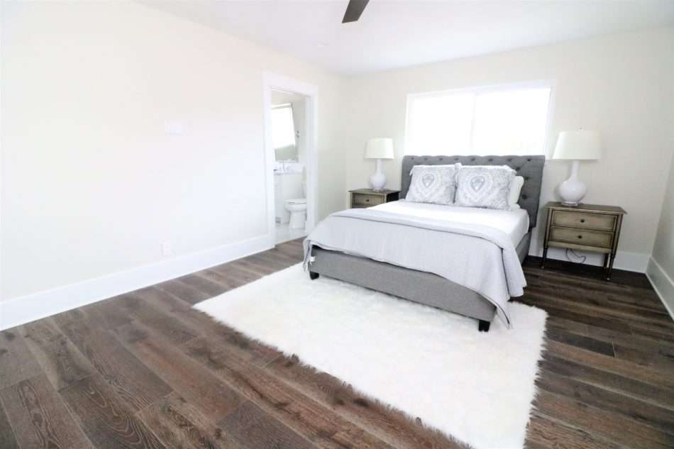
Recently, MRI was part of a remodel of a craftsman-style home in a super trendy neighborhood in Houston. I am so excited to share the reveal today!
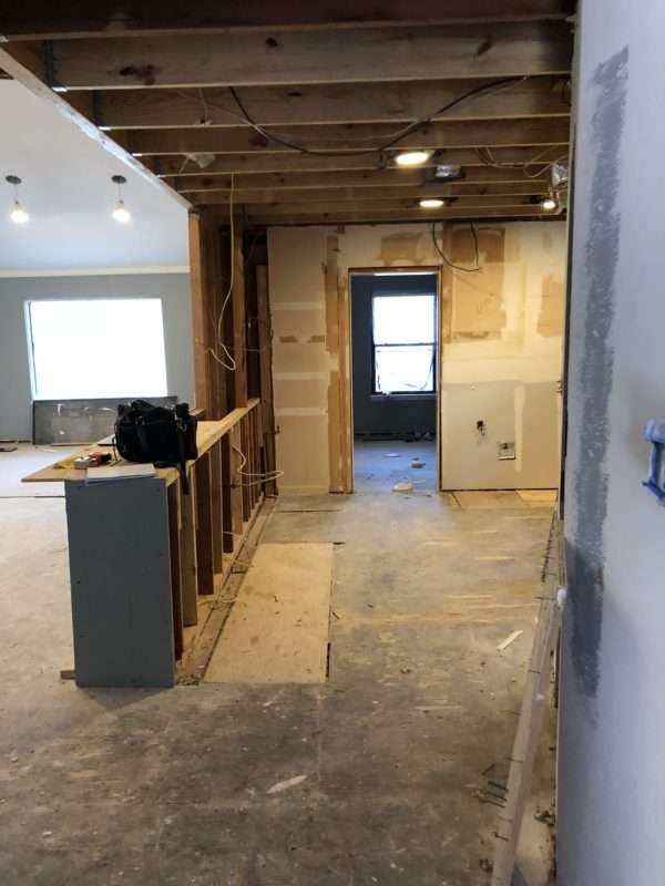
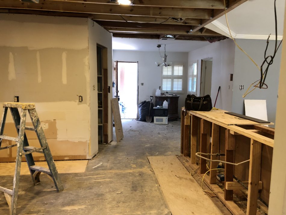
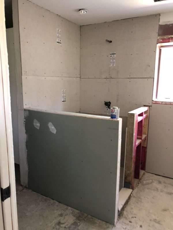
A little about the original house, honestly there isn’t much left of it. The house was gutted and brought down to the studs and completely rebuilt to its original glory. I was brought in after the sledgehammer stage, can’t say I always miss the sledgehammer stage, walking into a clean blank slate isn’t too shabby.
The layout of the house was already determined. My task was to design the home, selecting all the finishes, from flooring to ceiling with everything in between. The result is bringing this craftsman home back to life and may I say some AMAZING details. ENJOY!

Before
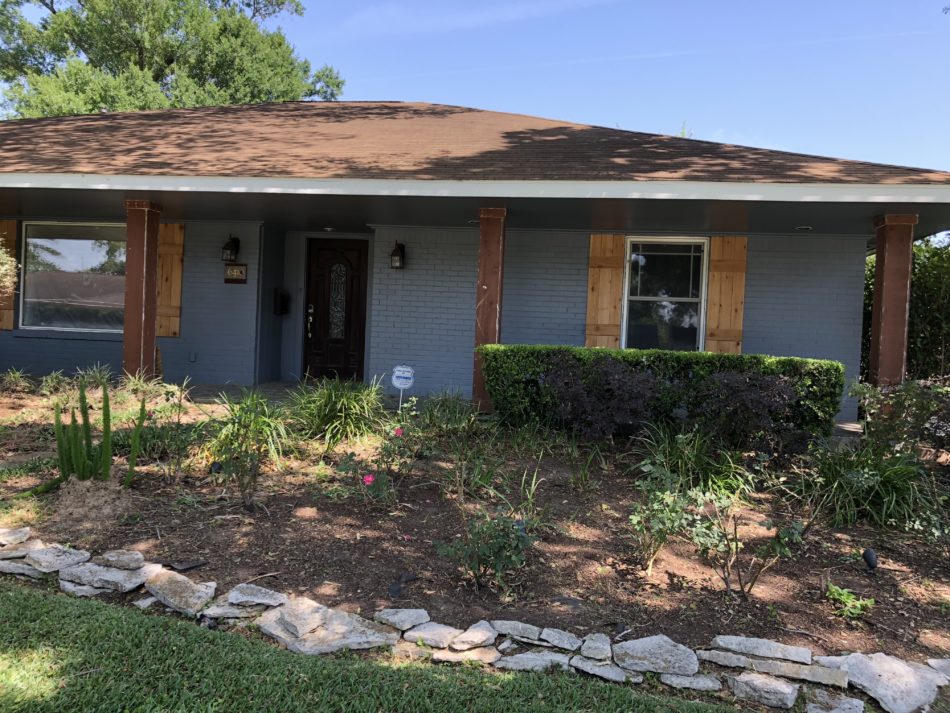
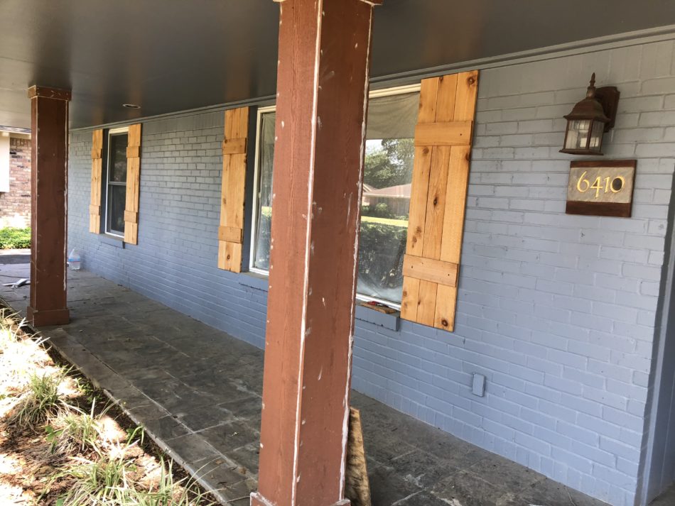
First things first… let’s take a look at the house from the moment I met with this family to begin the design process. The exterior was in desperate need of some TLC.
Exterior
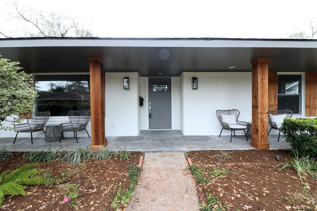
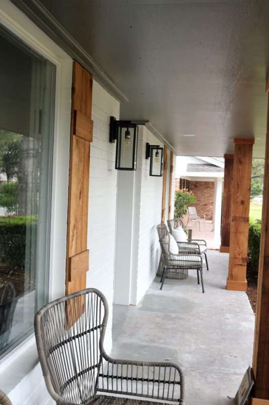
The exterior design of the house stays true to a craftsman style home keeping the low-pitched roofline, wide overhanging eaves and covered front porch with cedar pillars lining the entry. We wanted to bring in design elements and features from this century while keeping the history of the home intact, making the house feel updated. Mixing the black metal sconces with the cedar pillars and shutters adds uniqueness to the home that this Houston Heights neighborhood requires.
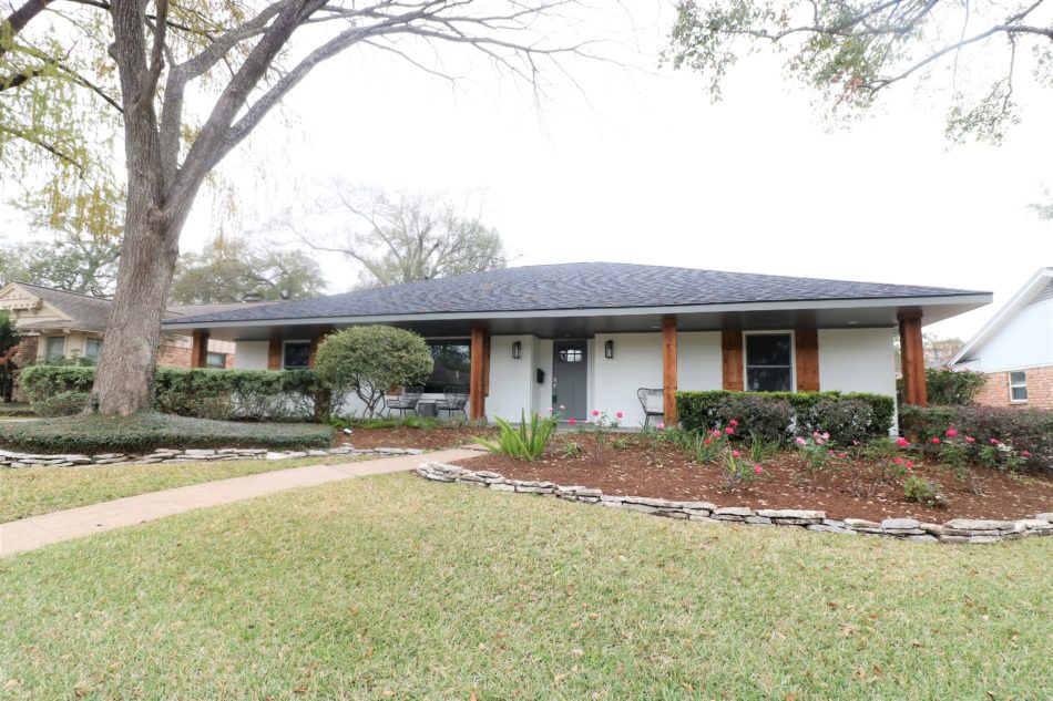
Painting the exterior brick a dark gray color was another modern touch while keeping true to the original style.
Living and Dining Room
A craftsman home typically features unique details such as built-in storage, nooks, window seats with the ultimate goal of making the home more functional for its owners. However, in this case, the owners are unknown as this is a flip house. When designing a home where the end owners are not known, it is crucial to select a palette which is pleasing to the mass, but at the same time add uniqueness by incorporating intricate details throughout the home, lending a custom-built look.
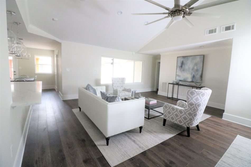
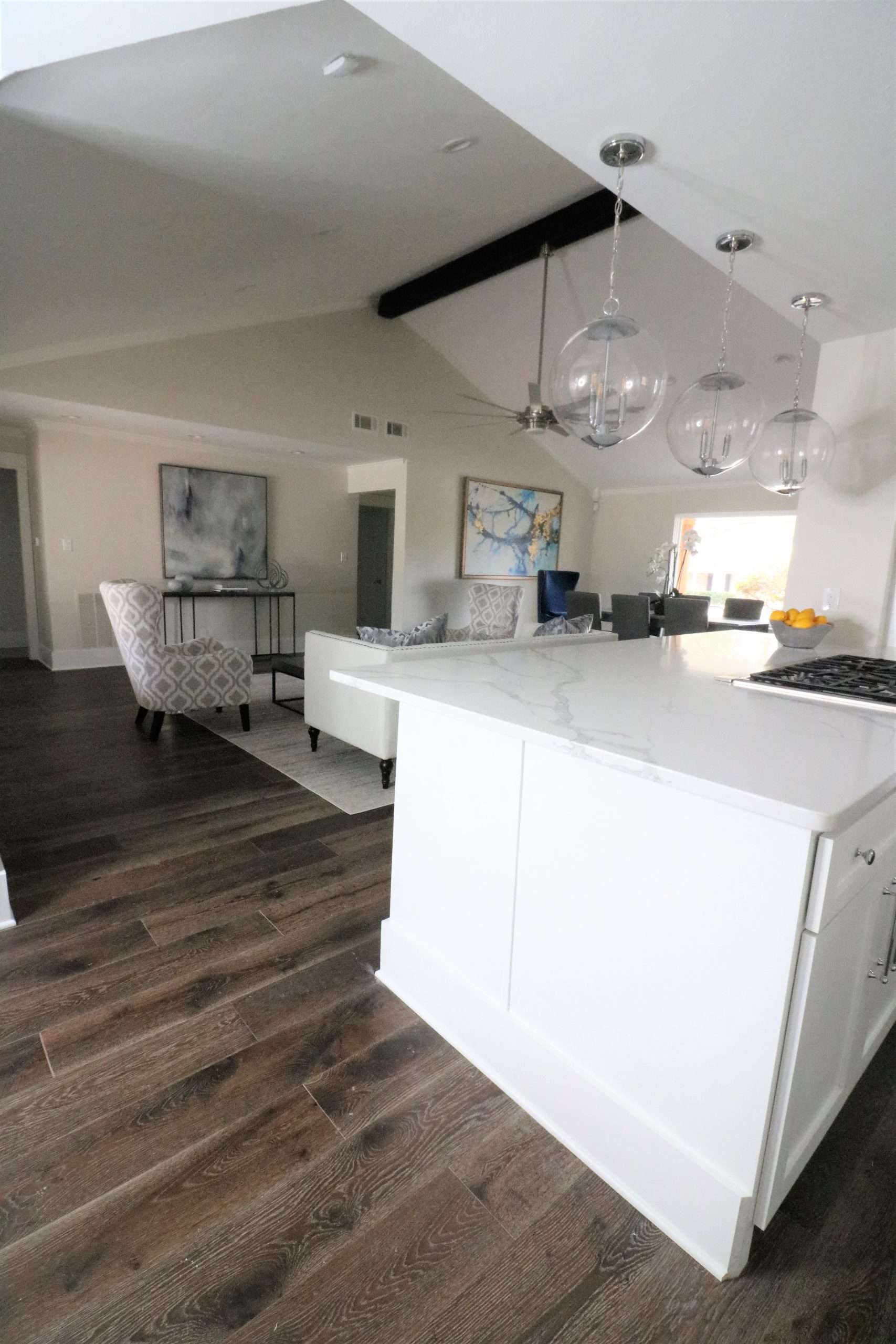
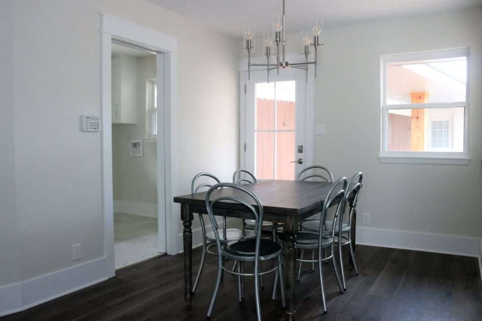
The foyer entry opens into this vast living space with true open concept. The main living space houses the living room, ample space for a formal dining area and open kitchen, creating an entertainer’s paradise.
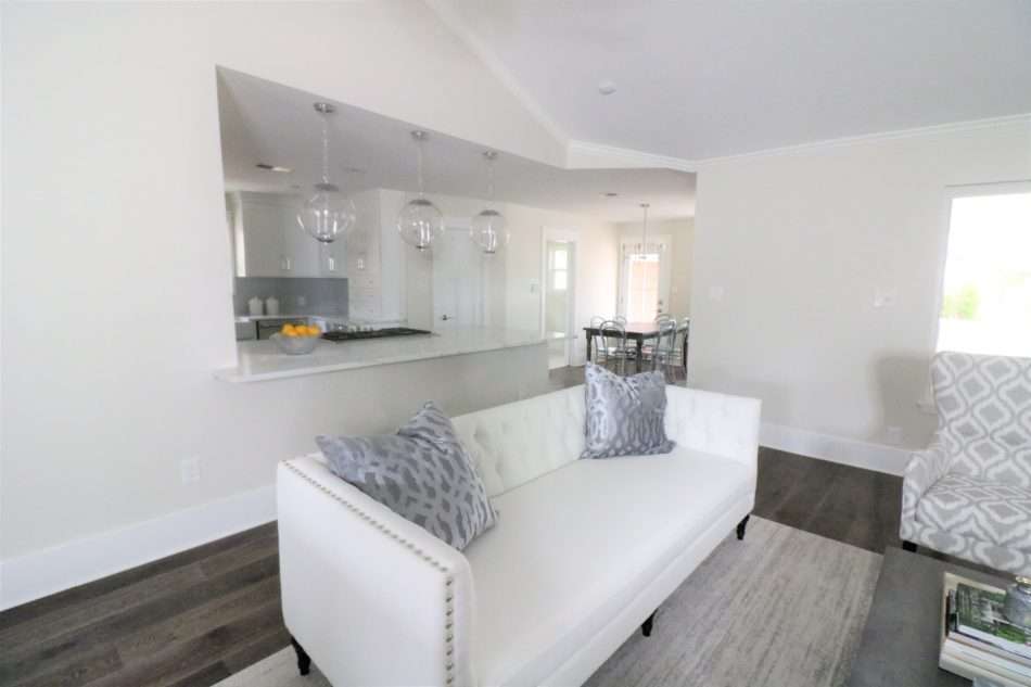
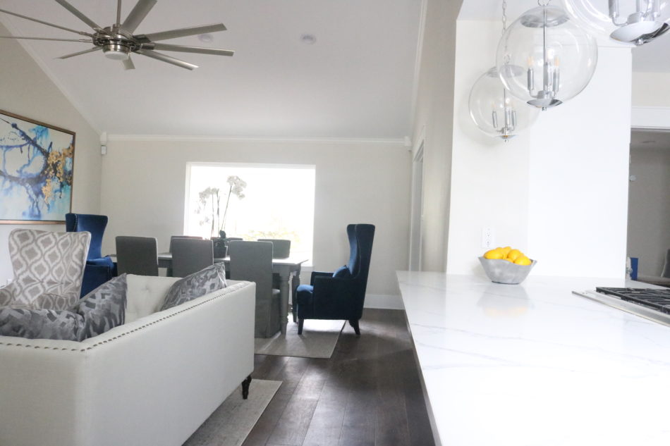
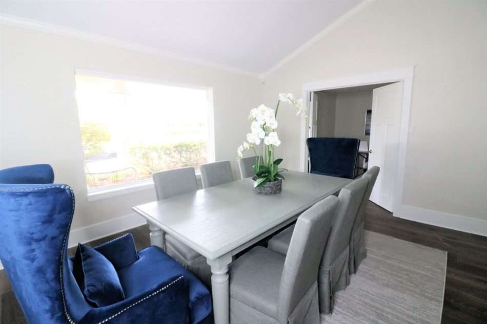
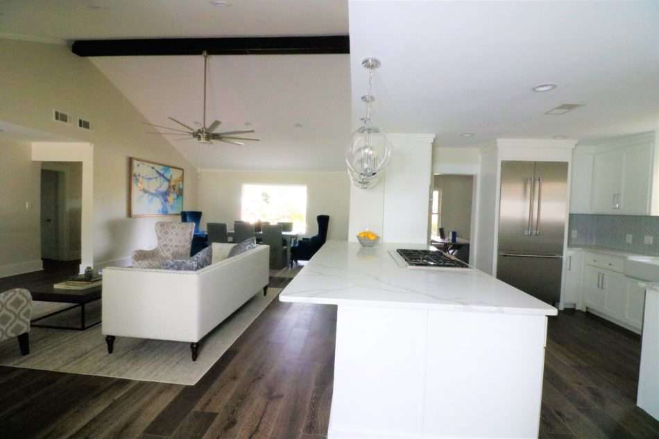
The exposed wood beam highlights the cathedral ceilings while staying true to the home’s craftsman design.
Shop Craftsman Home Fixtures
Kitchen
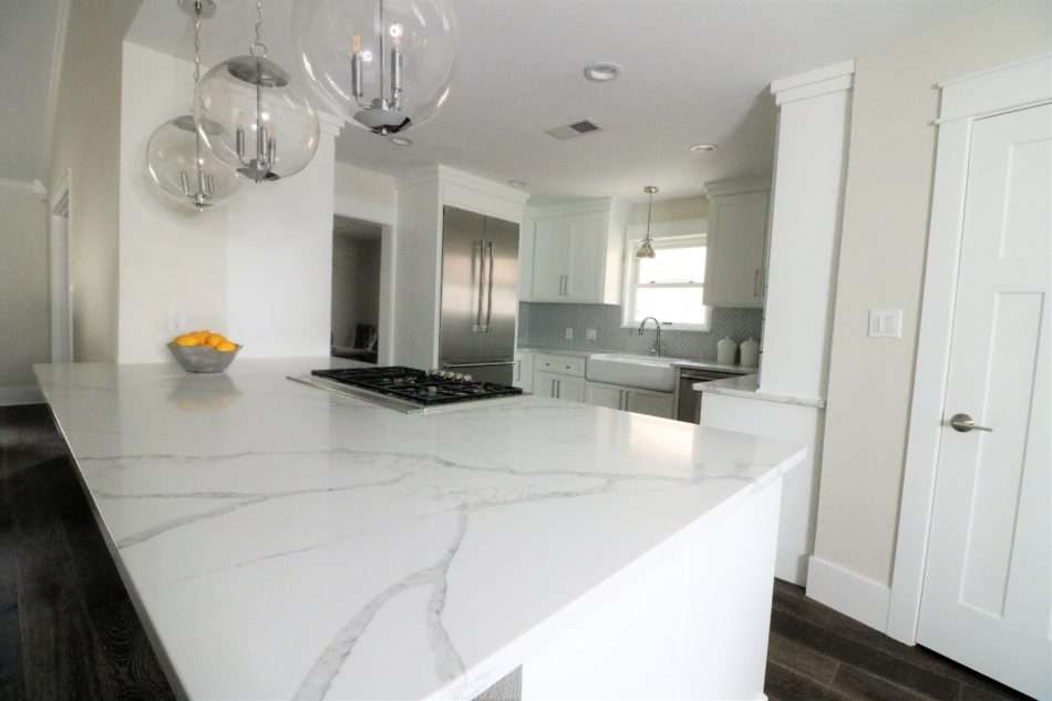
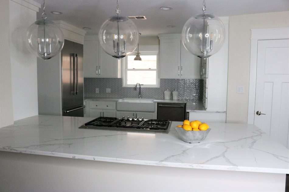
When you are dealing with a remodel with the intentions of selling, you have to be budget-conscious. When the builder has configured the kitchen, they designed it where every inch of space is utilized perfectly, creating a chef’s dream kitchen.
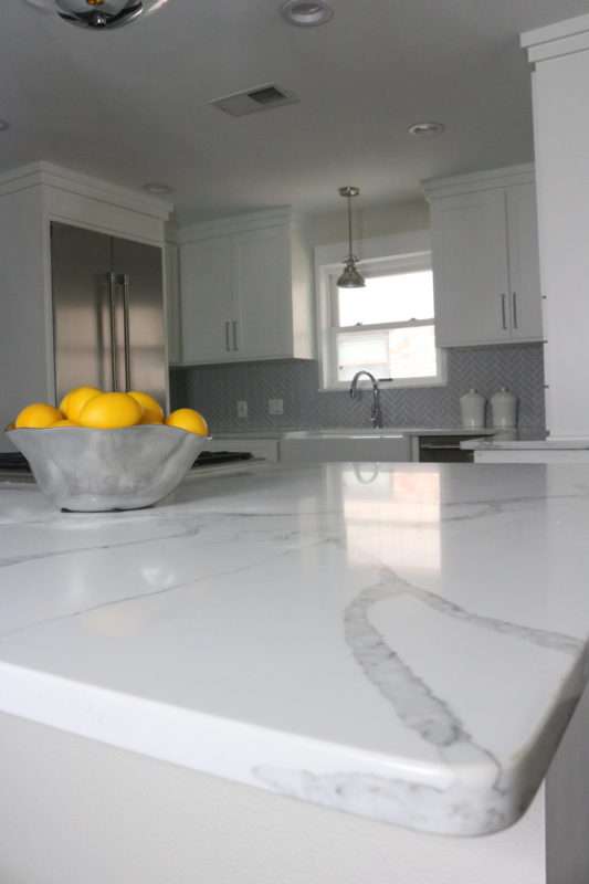
The vein detail in the Calcutta counter-top is AMAZING… pictures cannot do it justice.
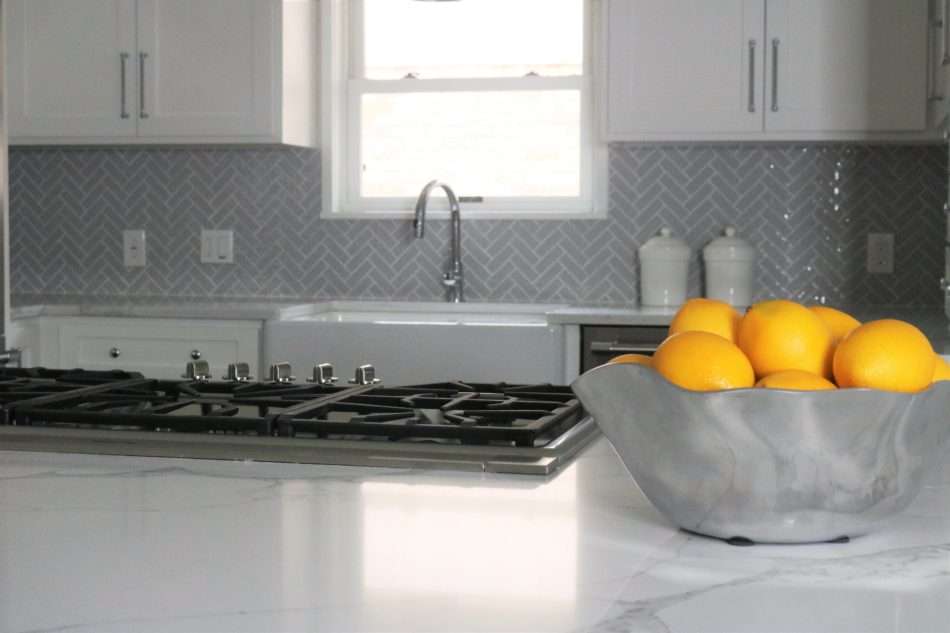
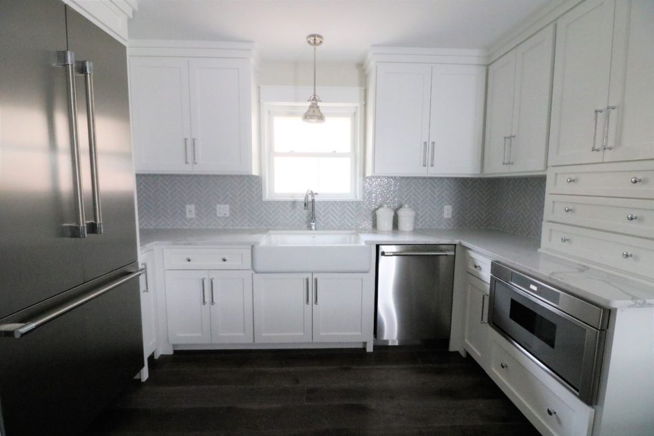
Knowing the kitchen would be the key to selling this home, so I wanted to keep it classic but also the room needed to be unique and exciting. This glazed ceramic tile is perfect with the herringbone pattern. It added so much visual interest to the room while leaving the room neutral and ready for any homeowner.
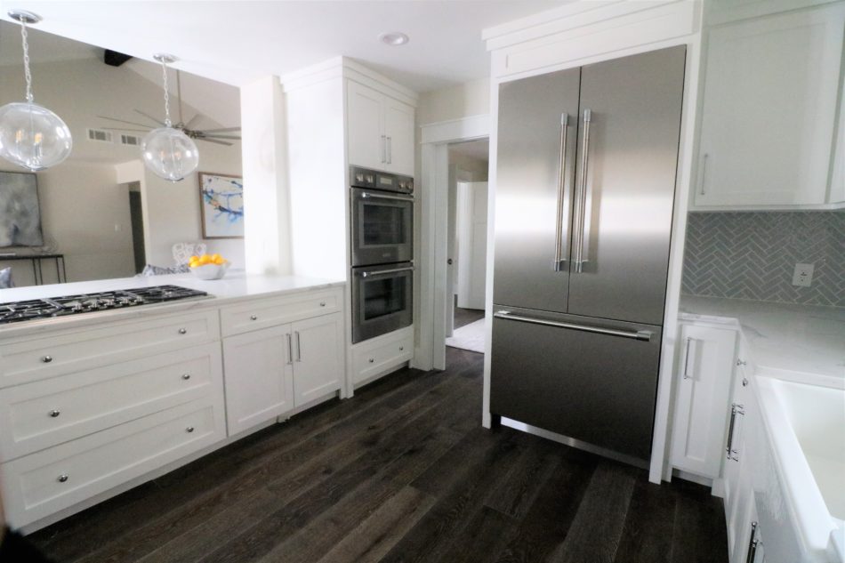
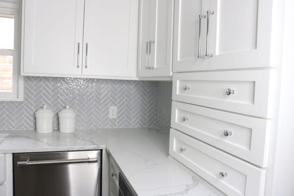
This counter storage space could be my favorite feature in this home. We added this feature to counterbalance the heaviness of the fridge on the left side of the room.
Powder Room
The tiles in this bath are TO DIE FOR. Tile, tile, and more tile! Let the patterns play!
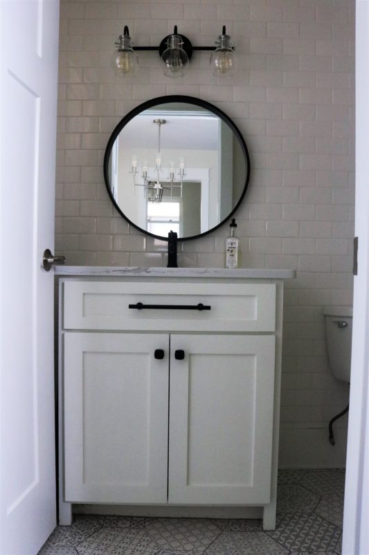
I love powder rooms that make a statement. Buyers are always looking for that extra bit of detail that wows them; the powder room is one of the best places to incorporate the WOW factor. Designing the primary wall to be completely tiled with 3×6 Arctic White subway tile.
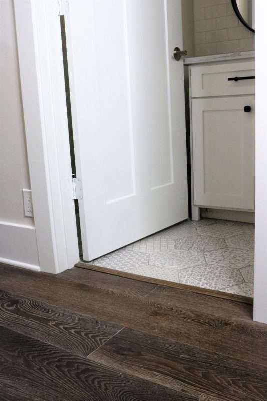
The Carrara hex decorative tile has such a fun pattern with a hexagon shape that is trending right now!
Laundry Room
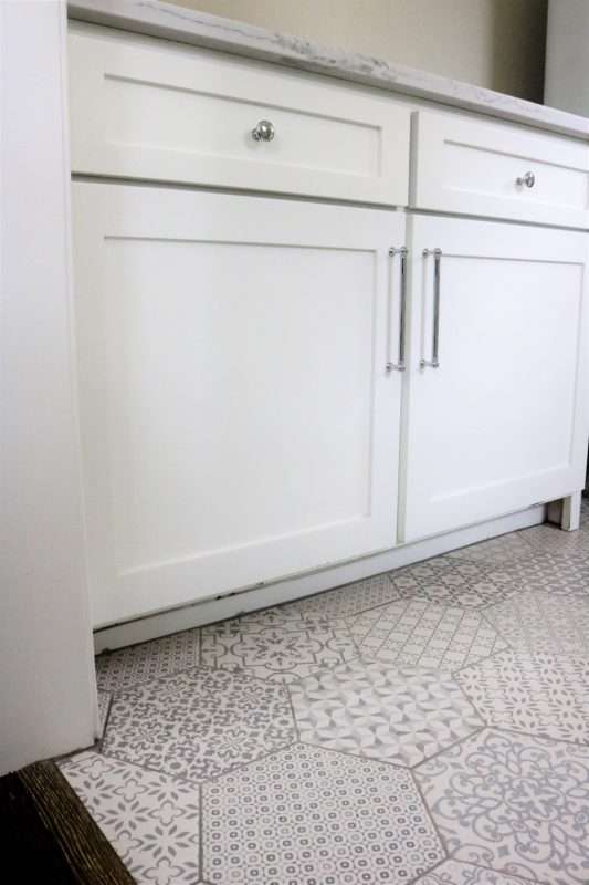
This room is directly across from the powder room, so we chose the same floor for both, saving on the budget but making this space far more unique than your standard laundry room.
Hall Bath
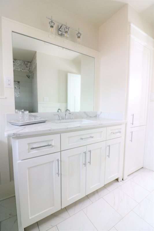
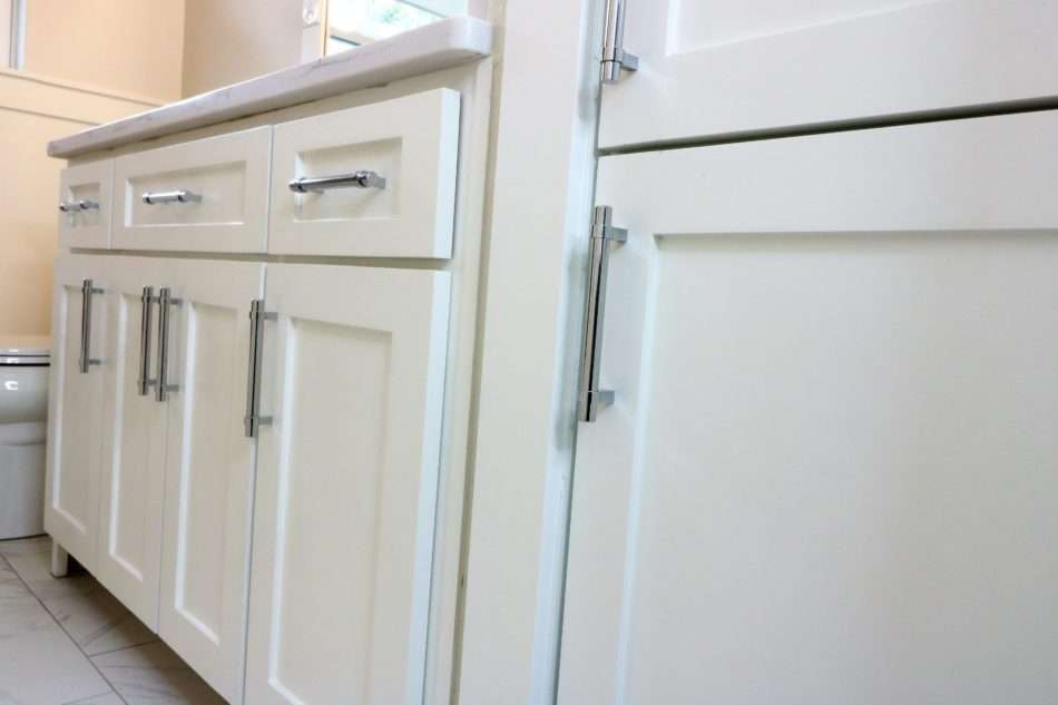
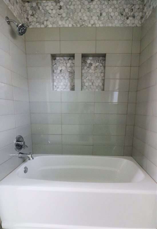
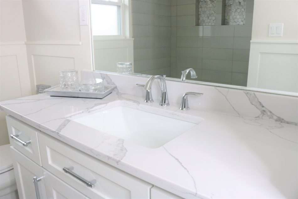
The hall bath was designed with kids in mind. Typically marble isn’t the best choice when used in places where kids will spend a lot of time. Instead, we used a product finished that had the marble appearance but used marble hexagon mosaic in the shower as the accent tile.
The oversized subway tiles were laid stack bond giving this classic tile a modern lay. We added texture by incorporating wainscotting around the room and by custom framing the mirror with the same material. Love these little details!
Shop Craftsman Home Furnishes
Master Suite
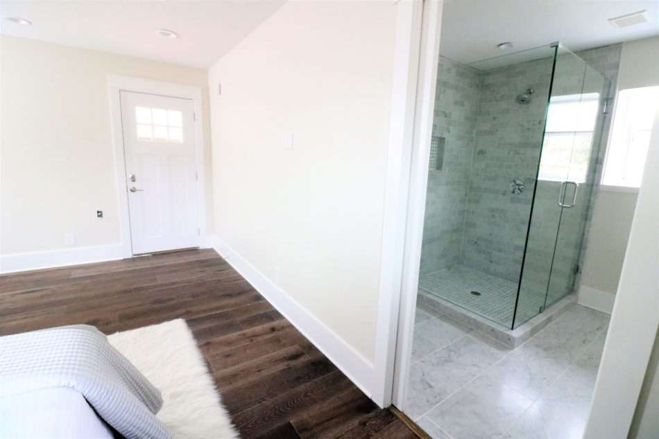
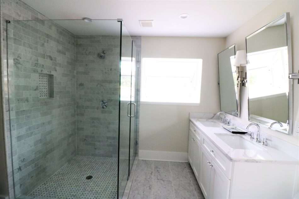
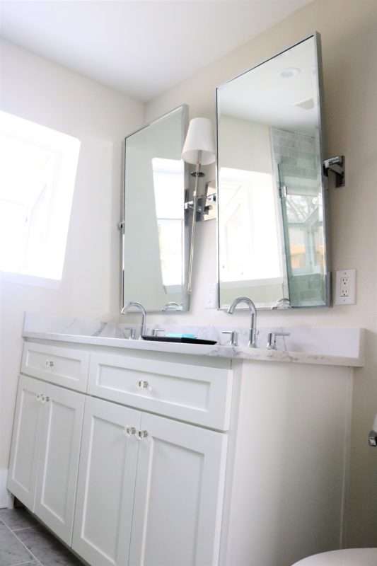
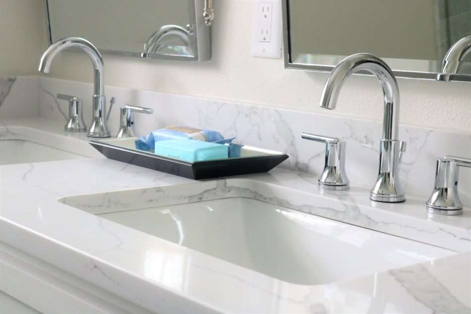
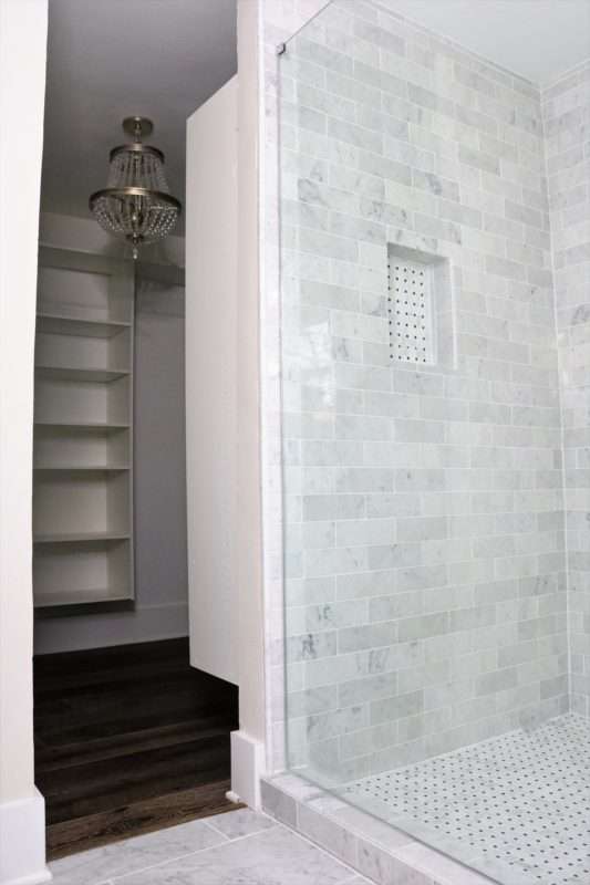
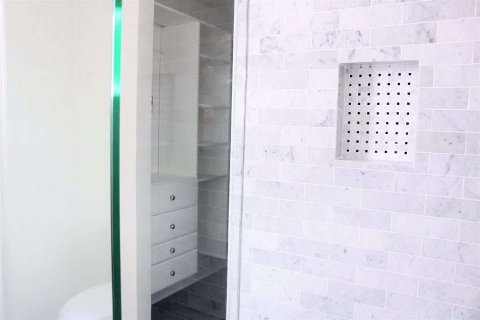
A closet that dreams are made of! This spacious walk-in closet was polished with a stunning chandelier and white cabinetry.
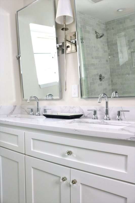

This modern-day craftsman style house is full of neutral tones, stunning yet understated details, and is ready to make its future owners memories come to life! When remodeling an older home, it is of utmost importance to stay true to its original character of the house, while adding in a modern flair. Don’t be afraid to mix old with new and different design styles together. After all, it is one of the top interior design trends for 2019.
P.S. This house sold just a few days after listing, for over listing price. Add in those luxury finishes, you’ll get your return!

