We recently completed a master bedroom for our lovely client with spectacular taste. I was honored to get another phone call asking for me to complete her office and dining room with transitional style. The results are something to talk about…
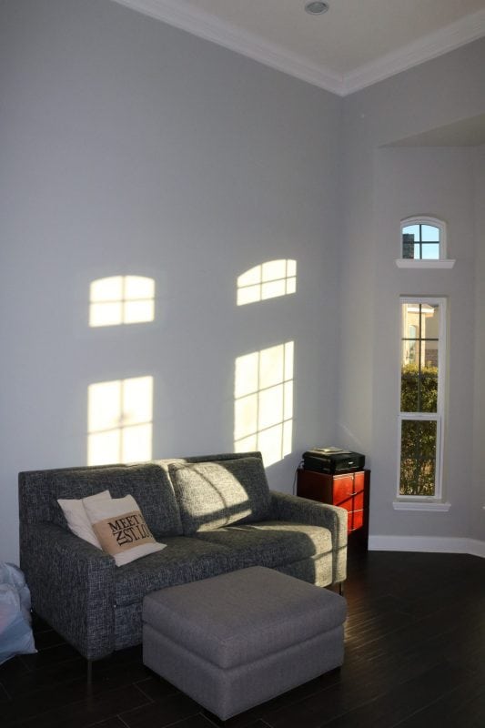
Office Before

After
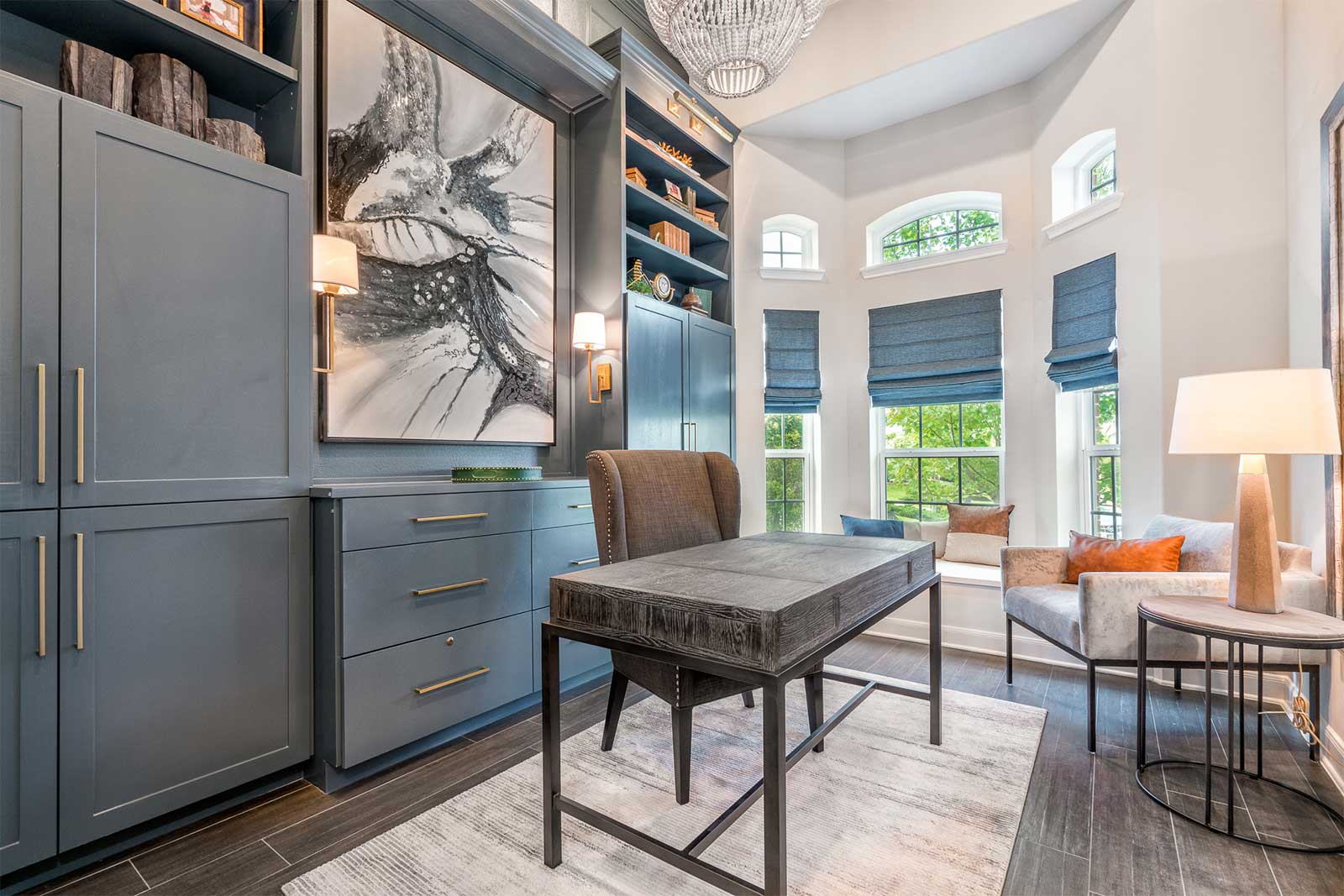
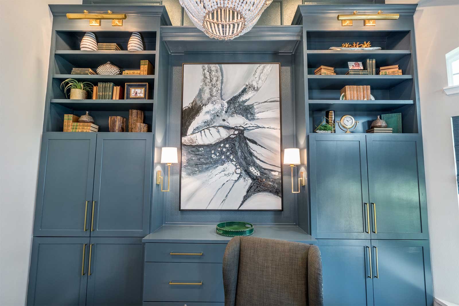
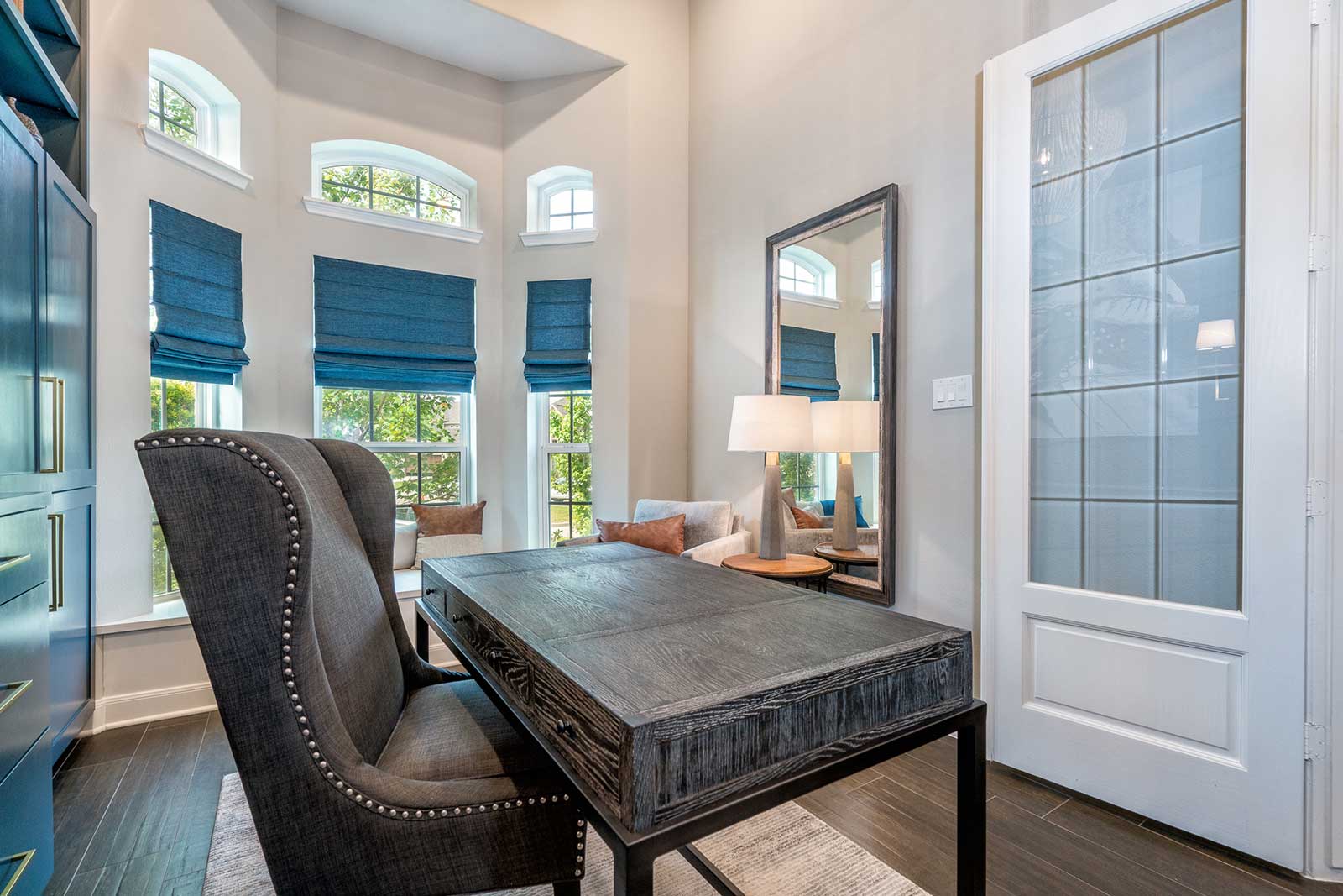
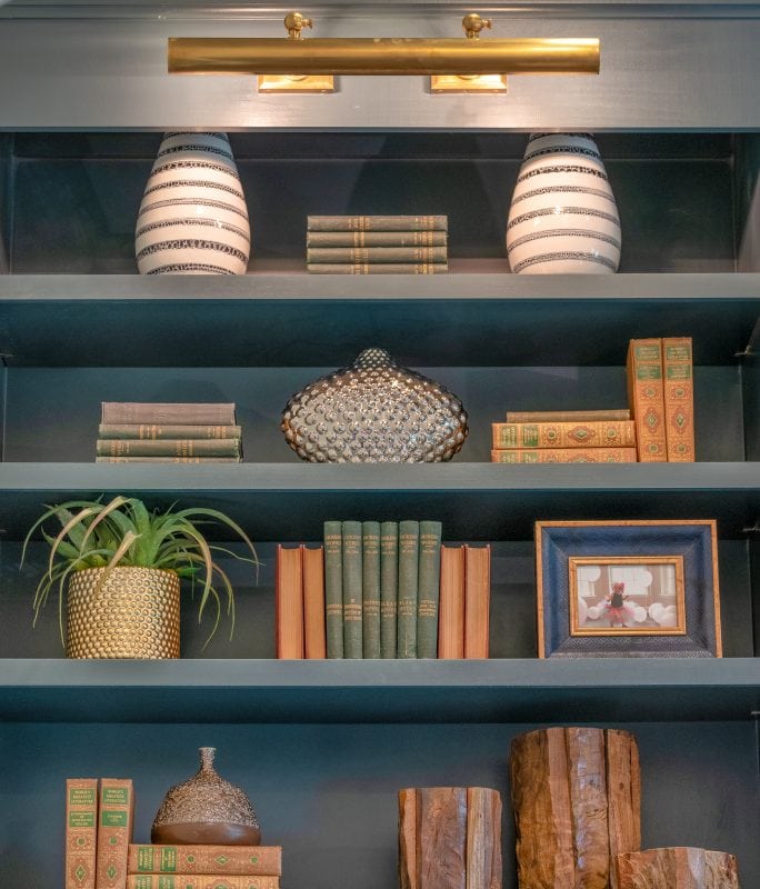
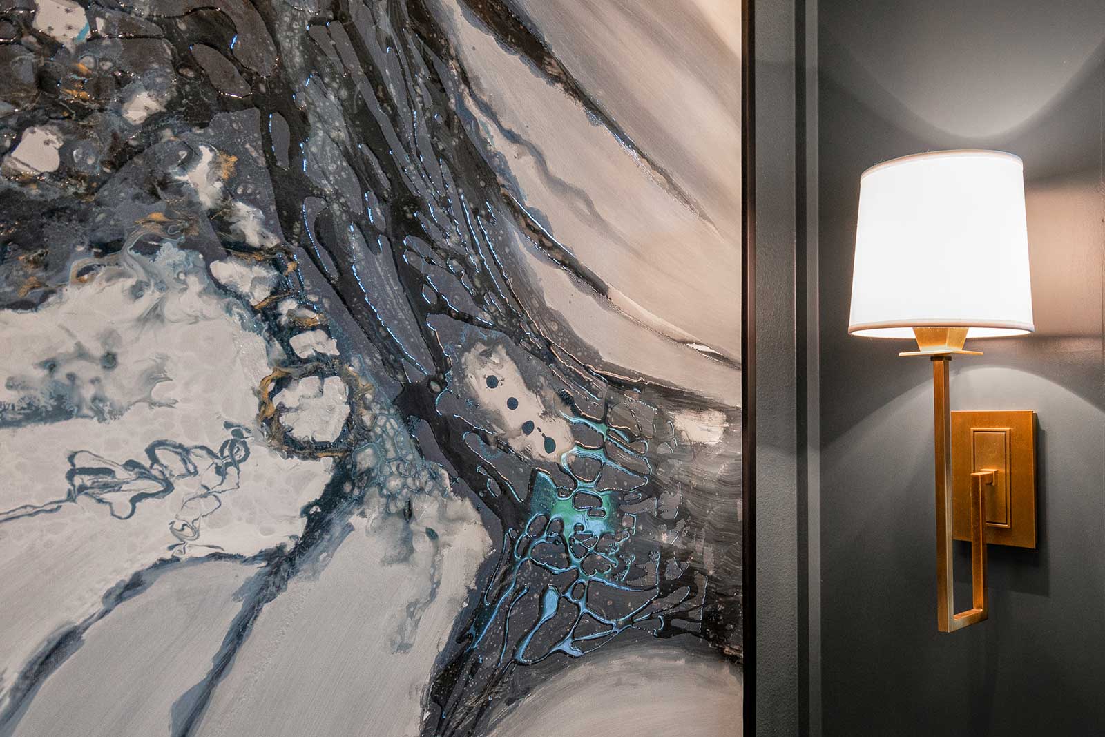
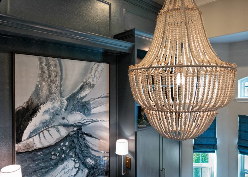
This office is one of my favorite projects to date. We made some bold choices which really made this room stand out. We started by adding custom cabinetry designed to fit not only the space but the client’s needs. One example is that we added a pull out behind the cabinet doors for the printer. This keeps the office functional but also stylish. Let’s also talk about this LARGE piece of art. Isn’t it amazing? I love the different shades of blues and grays which ties this room together! We added 4 sconces to the cabinets and used a beaded chandelier to give this room a natural element.
- Cabinet Color: Brush Blue by Benjamin Moore
- Wall Color: Repose Gray by Sherwin Williams
- Ceiling Color: Dovetail by Sherwin Williams
- Roman Shades: Brisbane Marina
- Chandelier
- Cabinet Hardware
- Wall Sconce
- Same Wall Sconce (smaller size)
- Picture Sconce
- Leather Pillow
- Lumbar Pillow
- Leather & Linen Pillow
- Accent Chair or Here
- Mirror
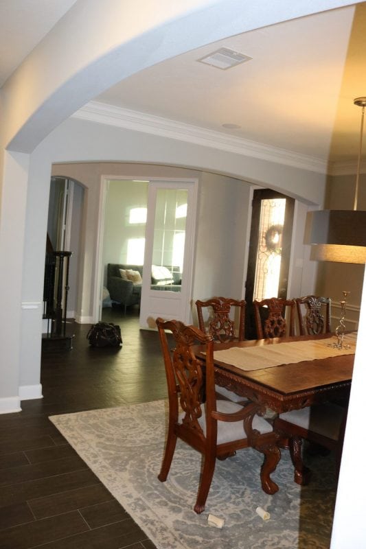
Dining Room Before
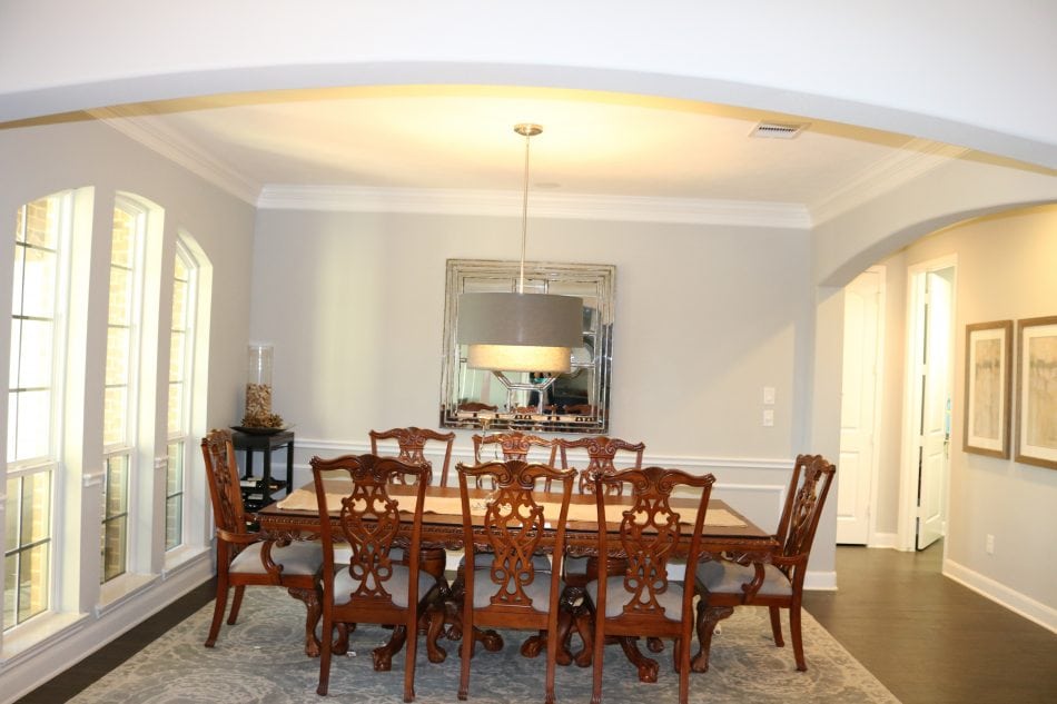
After
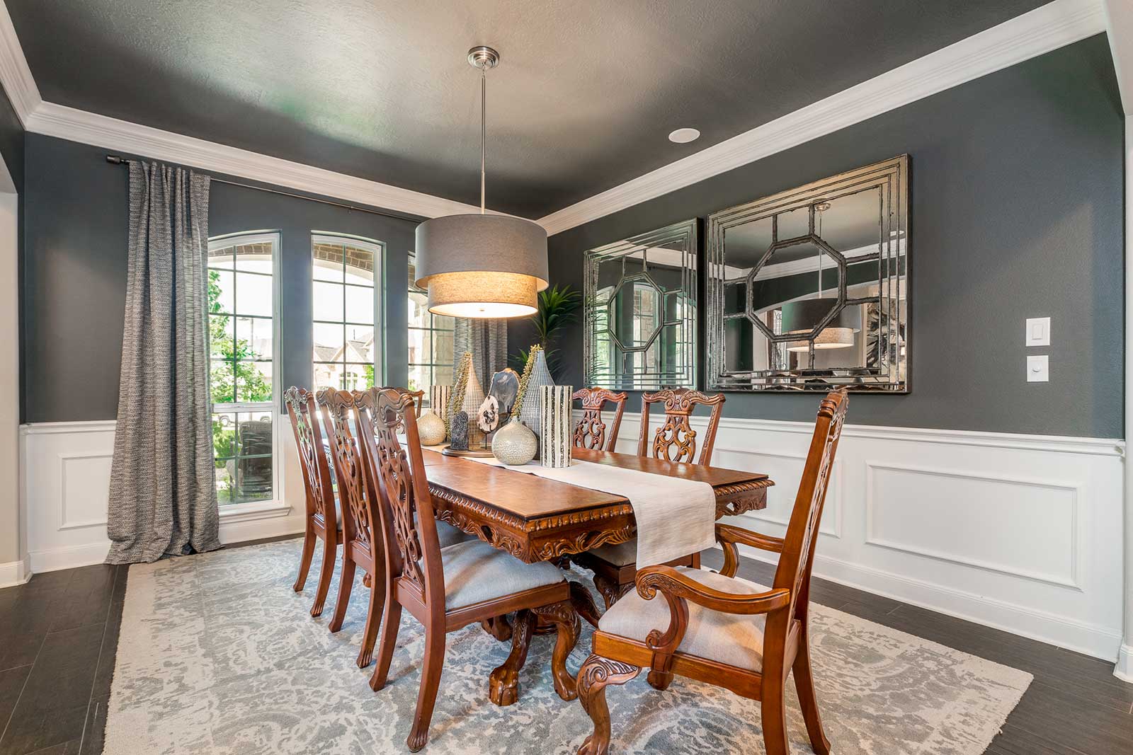
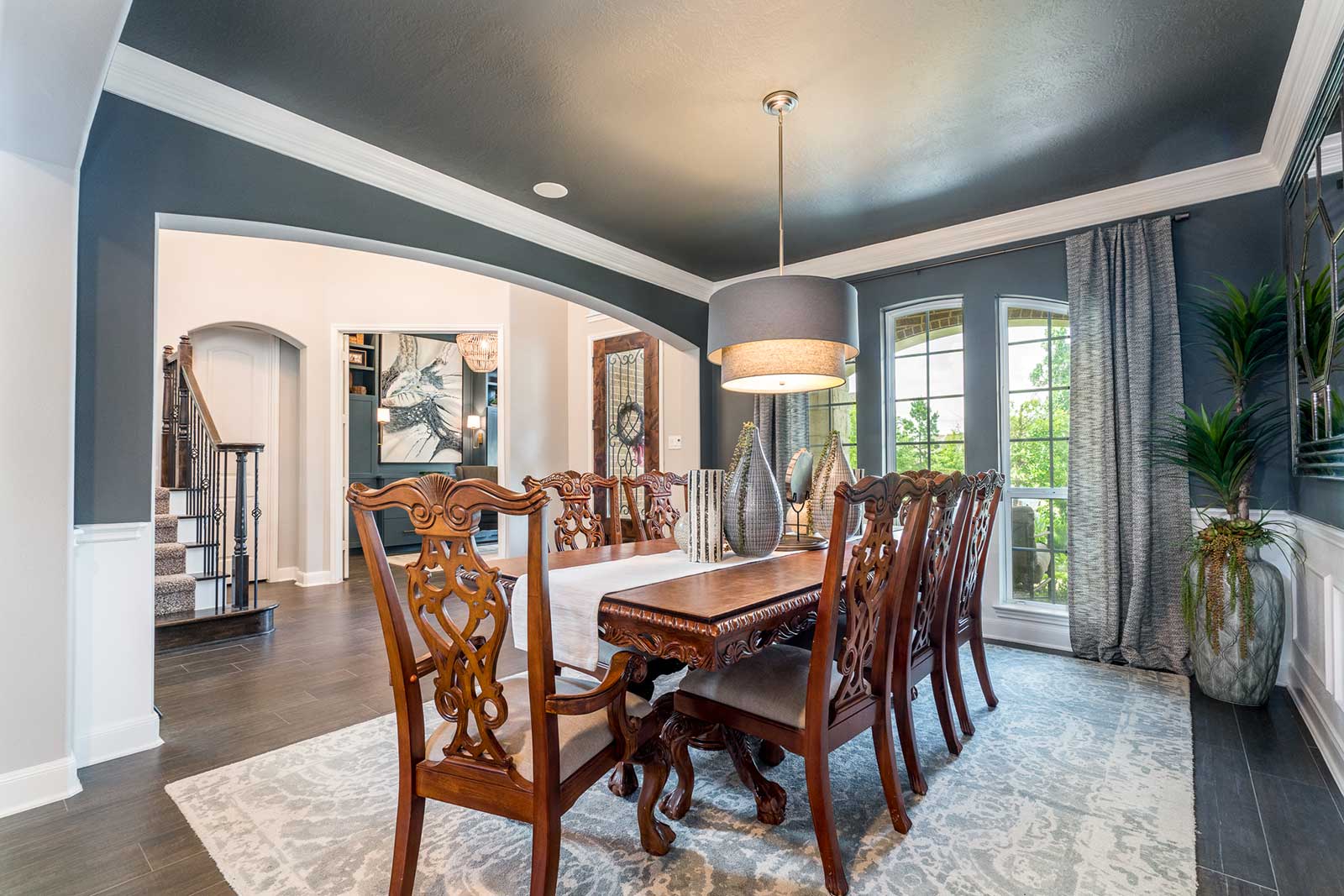
Can we please take a moment to admire this dining room? This dining set was passed down from the mother and is something special in this house. I love that we were able to use this traditional set and incorporate more modern pieces. The room started with builder grade paint and trim work. We didn’t have a large budget for this room. I mean let’s be real. Not every one has thousands to spend on home decor! Plus we needed to maximize our budget in the office. But I love how we made such a transformation by using contrasting paint to the bright white, chair rail.
We didn’t have the finances to add more mil-work to the lower section of the walls. When this happens I find that simply matching the Sheetrock to the trim can make a world of a difference. Now it looks like custom wainscoting but without the bank statement to prove it.
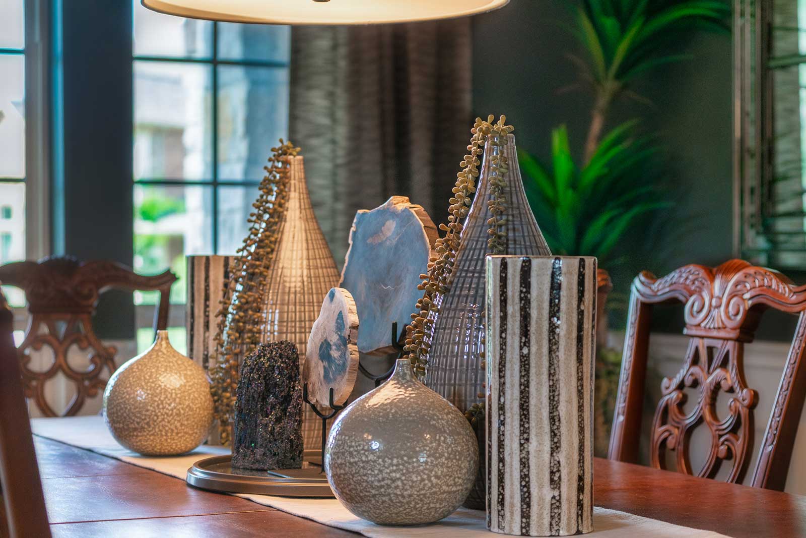
We made a simple statement on the table by adding cases with a touch of greenery. My client said “Let’s be honest. I fold laundry on this table; I need space for everyday use.” We left her lots of work space for the kids to sit and color while mom folds laundry. We added a custom floor plant (designed by yours truly) set in a dramatic, over sized vase to bring life to the back corner.
- Walls and ceiling: Grizzlie Gray SW 7068 by Sherwin Williams
- Drapery Panels
- Drapery Rod
- Similar Chandelier
- Tall Vase
- Striped Vase
- Small Vase
- Artificial Greenery
- Wall Mirrors
- Antiqued Mirror Tray
- Floor Vase
- Grass-cloth Table Runner
- Yucca Tree
Master Bedroom Recap
OR
Click to see original blog post
Most items have been linked above with one click that will take you to this exact item for easy shopping!
I would love to hear what you think about this transformation. Leave a comment below!




Thoughts?
Nicole
7 years ago
This turned out beautifully. I’m working on something similar for a dining room turned office. Loving your posts!
Melissa Roberts
7 years ago
Aww!! I truly appreciate that. Truly made my day!
YOUR COMMENT